37 was a transparency exercise. Especially the cadmiums covered well.
38 compared tonal range of a light wash to a heavy application of a pigment.
49 and 50 were about comparing light washes of a pigment with a mix with Titanium White.


 All my mixing exercises have used Winsor and Newton exclusively. But tonight, I slipped in the right hand column using M. Graham Yellow Ochre. I think this pigment might be a bit cooler than the W&N. This is my very first M. Graham experience. I found the paint a good deal smoother than W&N, not so heavy, much easier to mix. Smelled funny... Plastic? Fishy? Dunno... more sniffing needed. And, of course, do need to try more paints.


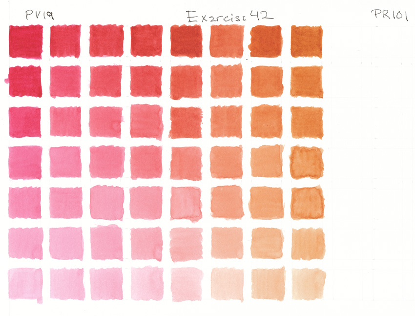


 Dearest reader, you must be so tired of color squares. To be honest, sometimes it is a chore here, but I am learning, maybe more than I can now realize. Soon the birds will have flown and the squares all filled, just about the time my watercolor course begins. Change is afoot...


 Phthalo Green is a powerful pigment. Just a bit goes a long way.
 I have twice emailed Winsor and Newton regarding their cadmium mixes and sadly they have disregarded my queries. On the other hand, within an hour of emailing Natural Pigments regarding an overcharge on my recent order, I received a phone call assuring me that their billing mistake was corrected and never made it onto my credit card. Nice going NP! Shame on you, W&N.
 Tomorrow's exercise will the last in the series of mixes involving only the six colors--Cadmium Scarlet, Permanent Rose, French Ultramarine, Cerulean Blue, Winsor Lemon and Cadmium Yellow. (That is, except for Exercise 9 with the Pthalo Blue.)
 Similar to the previous exercise, except this green leans into yellow. As the green drops out with increasing doses of red, orange appears.
 Something that seems to have fallen by the wayside in this scan is the wonderful granulation that Cerulean Blue brings to these mixes. In fact, the mixed pigments in wash on my palette needed constant stirring up. Other qualities come to mind--transparency to opaqueness and staining ability, properties that I've rather disregarded in these exercise posts, although have had some awareness in my exercises.
 Wow, what beautiful mixes! I just love these center colors. I've been altering my mixes. Instead of simply watering down the mix each time for each square, I'm washing in a few at a time and glazing over to grade them out. It makes things a bit easier to control but I must remember to wait until a square is quite dry before trying to glaze. Otherwise, I might be likely to lift the pigments rather than apply more.

 This series of complementary exercises has juggled a couple of blues against a range of oranges. From browns, grays, and subdued to brighter greens, the center point of these mixes has presented quite the range.
 If you have been unfortunate enough to closely read my exercise pigment descriptions (like the one above), you will have noticed that I regularly botch up the exercise numbers and the pigments. I'm a bit challenged with edits post cut and paste. That's my excuse and I'm sticking to it. ;-)
 The intent of these recent exercises has been to use various oranges against a stable violet blue. Next up will be a couple of exercises in similar fashion, the blue being the green blue Cerulean.


 These exercises open me to color. Not so much my brighter mixes... I am attracted to subdued colors and all their subtle variations. I get the urge to paint "something", not just my little three quarter inch squares, but I will continue to put my time into daily exercises. Soon enough I will be shifting focus--the water color course is due up in a month or so, leaving me just enough time to complete the book's fifty exercises.
.jpg) "Autorretrato con Collar de Espinas y Colibrí"
"Autorretrato con Collar de Espinas y Colibrí" I'm beginning to understand these recent exercises. They're kind of like a guided exploration. What happens when I dance around a complementary set? I've read about true complements being mixed to grays and I think I'm very close with today's exercises. It's all rather fascinating and exciting. :-)


 Nice clean, bright oranges, eh? Of course, the same principle we use here applied when mixing bright violets and bright greens. Start with pigments leaning towards the target color and it'll come up quite pure. Want less saturated secondaries? Use one or both pigments leaning away from the target color.


 Interesting how these greens are so bright. As these exercises go on I'm gaining a bit of comfort with where pigments are positioned in the color spectrum. Exercise 9 call for replacing the Cerulean Blue with Phthalocyanine Blue with the expectation of even brighter greens. Well, out of all my tubes of paint, I don't have this pigment so I'll simply pass on this exercise. Next up, Exercise 10 will be grayed oranges.


