Best wishes to all for a Happy New Year!
May this year bring you love, peace, joy and fine health.

Saturday, December 31, 2011
Friday, December 30, 2011
More of the same with dry glazing
Still playing with dry glazing. Last night's glazes dried easily in less than a day. I'm really having a fun time with this piece. It's such a different direction and it feels great to simply poke around exploring.

I'm experimenting with trying to pull a look of blue from vine black adjacent to ercolano red. Lighter tones seem to work best.


I'm experimenting with trying to pull a look of blue from vine black adjacent to ercolano red. Lighter tones seem to work best.

Thursday, December 29, 2011
Glazing Leanly
The previous session used hand-mixed paint and a lot of linseed oil for glazes. This session I used no extra oil, rather relying on a lightly charged brush of pure paint in the style of dry brushing. This kind of glaze, being lean, dries quickly. I find better control with dry brush glazing, getting lots of colors in without the paints mooshing together.

Not quite sure how I ended up with that upper left mess but I'll be cleaning it up next.

Not quite sure how I ended up with that upper left mess but I'll be cleaning it up next.
Wednesday, December 28, 2011
Glazing Chart
The horizontal rows are glazed upon the vertical columns. There is a real richness that is not conveyed in this photo--not sure if that effect will remain once dry. This chart is becoming something of a meditative device. Just look at those wonderful glazed browns in the fifth column. Right now they're my favorites.


Abstract Glazing
Yesterday's chart is still drying. I need to get a better glazing medium, probably some sun thickened oil. Until then, thin mixes with linseed oil do dry slowly and don't provide for much durability. But, it's just fine for practice.
I'm working with those same glazes here and they remind me of the delicacy of egg tempera. I think I'm leaning towards the thin and smooth oil painting, that is compared to an impasto or alla prima method. This is a small painting, only about 5" wide. The pastel assignment in my upcoming course is framed as a landscape. This piece could just be my pattern.

I'm working with those same glazes here and they remind me of the delicacy of egg tempera. I think I'm leaning towards the thin and smooth oil painting, that is compared to an impasto or alla prima method. This is a small painting, only about 5" wide. The pastel assignment in my upcoming course is framed as a landscape. This piece could just be my pattern.

Monday, December 26, 2011
Glazing
After reading that the order in which oil glazes are applied make for different colors, I had to stop, and think, and really came to no conclusion. I figured the best approach was to simply give it a try, so here's the first night's work. Once dry, I'll glaze horizontally and then compare.


Friday, December 23, 2011

Thursday, December 22, 2011
Pastel Ranges
Here's a quick test of the range of each pigment. There is a noticeable difference is hardness among these pastels, and especially noticeable towards the pure pigment end of each set. The yellow ochre and viridian were particularly scratchy. The black iron oxide was very soft, buttery is probably a good analogy, with the sticks breaking up easily. The white was soft and I think that influenced the light side of all the pigments.


Happy Soltice
Although this is the first day of winter, it's 56° F here after midnight! In the spirit and survival of wintertime, I'm going through the ritual of The Seed Catalog. Been dealing on and off since the 70's with Johnny's Selected Seeds. Seeds are almost as addicting as dry pigments.
Here's the Brandywine heirloom tomato. Reminds me of a tomato that might have been around in Melendez's time (Spain 1716-1795).

Here's the Brandywine heirloom tomato. Reminds me of a tomato that might have been around in Melendez's time (Spain 1716-1795).
Look around for a place to sow a few seeds.
~ Henry Van Dyke
Monday, December 19, 2011
Polarization
Here's my old apricot copy job with some light unifying glazes. This first image was taken with my new circular pollination filter adjusted for minimum glare.

And here's the same shot with the filter allowing maximum glare.

And lastly, here are my new pastels all laid out nicely.


And here's the same shot with the filter allowing maximum glare.

And lastly, here are my new pastels all laid out nicely.

Sunday, December 18, 2011
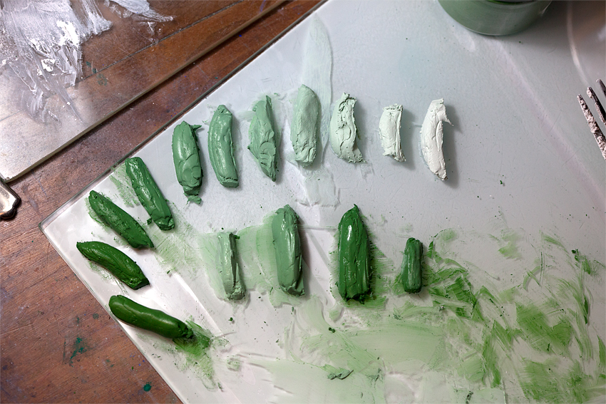
More Pastels
I cut yesterday's solution in half for this evening's work. A tool I neglected to mention is latex gloves. They sure make cleanup easier. I also made up a good amount of white and used it all.

Here is tonight's work. Black Iron Oxide, Raw Umber Green, French Ochre, and Gold Ochre. I found that rolling out on paper towels was easiest for controlling the sticks.


Here is tonight's work. Black Iron Oxide, Raw Umber Green, French Ochre, and Gold Ochre. I found that rolling out on paper towels was easiest for controlling the sticks.

I'm going to refrigerate the solutions just in case I decide to whip up another batch. But first I think it's time to try out the product! Besides, my Old Master copy work is waiting for my return.
An interesting byproduct is that these pastel sets make a good color chart of my pigments, nicely detailing what pigment mixes with white in oils and egg tempera would look like.
Saturday, December 17, 2011
Rolling my own
This afternoon the gum tragacanth came out of refrigeration and warmed up for a few hours. Then with a bit more warmth on a double boiler, the solution was nearly lump free.

4 ounces of solution was mixed with 12 ounces of distilled water (1:3) to accommodate a few selected pigments. Different pigments require different strength solutions. (More on that in a later post.)

For the white base, used for white chalk and tinting other pigments, 2 ounces of titanium white was dry mixed with 6 ounces of chalk.

2 ounces of the white base materials was mixed with 4 tsp of the 1:3 solution. (A second batch was later mixed.)

The first sticks were made of white chalk. Then quickly came ultramarine blue reddish (2 tbsp pigment and 2.5 tsp 1:3 solution).

An often described process is to divide pure pigment sticks into quarters and mix down with white, continuing to quarter and mix down. I found comfort in simply mixing my own tonal range by eye. Sometimes I'd mix straight pure pigment and white; sometimes I'd start with a bit of a previous stick, a method somewhat similar to the quarter and mix down method but without the structure.

Here's a set of viridian all mixed out. (1 tbsp viridian and 1.75 tsp 1:3 solution)

And here's the viridian set rolled out.

Now with a comfortable process established I was able to focus on extending the tonal nuances.

And here's the chromium oxide set. (2 tbsp pigment and 1 tsp 1:3 solution)

Some of my pigment/solution recipes might be off. I tried to keep ongoing records but kept getting caught up in the process.
The sticks should be dry within a day or two. In the meantime, I'll get into my earths.
I'm rolling on the thin side and don't know if there will be a durability issue there. Some pastel makers shape into triangles as they like points and sharp edges.
A couple of lessons learned:

4 ounces of solution was mixed with 12 ounces of distilled water (1:3) to accommodate a few selected pigments. Different pigments require different strength solutions. (More on that in a later post.)

For the white base, used for white chalk and tinting other pigments, 2 ounces of titanium white was dry mixed with 6 ounces of chalk.

2 ounces of the white base materials was mixed with 4 tsp of the 1:3 solution. (A second batch was later mixed.)

The first sticks were made of white chalk. Then quickly came ultramarine blue reddish (2 tbsp pigment and 2.5 tsp 1:3 solution).

An often described process is to divide pure pigment sticks into quarters and mix down with white, continuing to quarter and mix down. I found comfort in simply mixing my own tonal range by eye. Sometimes I'd mix straight pure pigment and white; sometimes I'd start with a bit of a previous stick, a method somewhat similar to the quarter and mix down method but without the structure.

Here's a set of viridian all mixed out. (1 tbsp viridian and 1.75 tsp 1:3 solution)

And here's the viridian set rolled out.

Now with a comfortable process established I was able to focus on extending the tonal nuances.
And here's the chromium oxide set. (2 tbsp pigment and 1 tsp 1:3 solution)

Some of my pigment/solution recipes might be off. I tried to keep ongoing records but kept getting caught up in the process.
The sticks should be dry within a day or two. In the meantime, I'll get into my earths.
I'm rolling on the thin side and don't know if there will be a durability issue there. Some pastel makers shape into triangles as they like points and sharp edges.
A couple of lessons learned:
- Mixing 450 ml of gum tragacanth starter is a lot. Half that would still be plenty. I'm only using teaspoons of diluted solution and many pigments require even more diluted solutions.
- Mixing lots of white is useful. It is used in every stick except the pure pigment.
Friday, December 16, 2011
Gum Tragacanth Continued

From Kremer's gum tragacanth specification sheet:
Gum Tragacanth is the dried exudate produced from Astragalus gummifer, which grows particularly in Iran. Tragacanth has the food additive number E413 in Europe.
Solubility: in water to a soft, stiff, opalescent slime.

From the Karawan Trading Corporation:
Tragacanth is one of the oldest gums known and its use dates back to 5000 years ago. This plant is used in traditional Iranian medicine for improving the human immune system and alleviating side effects of other pharmaceuticals. It is much used for the suspension of heavy, insoluble powders to impact consistence to lozenges, being superior to Gum Arabic, also in making emulsions, mucilage, etc. It is also employed by manufactures for shifting calico, crape, etc.
The gum is obtained from the plant . The farmers start harvesting from May and finish in September. In the west of Iran, where the weather is colder, it lasts until October; the farmers call their harvesting seasons spring and autumn. According to our experience the viscosity level in spring harvest is higher than in the autumn. The roots of the plants are scored with a special knife. The dried gum then seeps from the cuts and is collected by hand. It is later sorted by colour into different qualities.
From my kitchen:
Yesterday's mix is thickening and still with blobs of gum. Tomorrow I'll wrap up the solution and just might start making pastels!

Thursday, December 15, 2011
Gum Tragacanth
There's to be pastel work in the upcoming Cornell course. So with all these wonderful dry pigments here, I figured why not try whipping up my own pastels. My latest Kremer order arrived today with, as well as a couple of new earths, a 100 gram bag of Gum Tragacanth.
Gum Tragacanth is a popular binder material for pastel making. The standard starter recipe is 1 part gum tragacanth to 30 parts distilled water. This evening's batch was 1 tablespoon to 15 ounces or, in metric, 15 ml to 450 ml.

Adding the gum to the water didn't lead to any immediate dilution.

And stirring only seemed to get clumps stuck all over the spoon. I'm reading that it can take up to two days for the gum to dissolve and form a gel. The mix should be refrigerated during this time. And that's where this is now at. Tomorrow we will take a peek at the expected progress. And by then, I should have some direction on next steps.

Wednesday, December 14, 2011
Edge
Here is a set of before and after shots that hopefully show how I am working with edges, particularly with the top apricot. My hard edges do have their place but there is a subtlety and beauty to be had by varying the relative hardness and softness of edges.
Along with edge experiments I'm exploring glazing. First needing some light scumbling for a base, I'm applying light coats of transparent earths. As well, I am developing shadow with warm umber glazes. It's all a slow moving but satisfying process.
Radiant Oils glazing techniques for paintings that glow by Arleta Pech arrived today, filling me with inspiration. Right off, I picked up a great suggestion, photographing oil paintings with a polarizing filter to reduce glare. There's one on the way here. And of course, this book is filled with exercises and ideas for glazing from an artist who first worked in watercolor and then applied her glazing to oils. More on this book as I work my way through.
 |
| Before edge work and glazing |
 |
| After edge work and glazing |
Tuesday, December 13, 2011
Cornell Botanical Illustration III
Cornell opened the course web site today and the course begins at the end of January. It's time for me to fill in as needed with supplies and get up to speed with requirements. For now, let me share these clips from our instructor Marcia's introduction:
Meanwhile, I continue to make incremental improvements to the apricots painting. Posting at this point wouldn't show much change but I'll get out a wrap up later this week.
Working from life
You will need to have some access to plant materials for drawing: houseplants, gardens, stems from the grocery store or florist, produce, collected leaves or twigs, etc. They need not be expensive, and can be very simple, but it is critical that you work from life. There will be times when working with a photograph or other image is tempting, appropriate, or perhaps necessary. For the requirements of this course, however, unless we ask you to use an image or a photograph for the photo, please work from the 'real thing.'
My Philosophy as an Instructor
This is a course that you are likely taking for your own personal enrichment and proficiency. As such, I hope that you are intrinsically motivated to complete readings and all assignments, including optional assignments, to devote considerable time to drawing, and to communicate with your colleagues freely and often in an effort to get the most from this course. I will assign readings, and I will assume you read them; I will not "test" you on content because I do not believe that should be your motivation. You will get from the course what you put into it.
Our communication will be positive and will focus on course content. Rude or offensive language, and overly critical commentary will not be tolerated. It is a course taken for enrichment, and the way we communicate with one another will be constructive.
Please be open with your feedback and feel free to contact us with any questions. Open dialogue is encouraged.
Meanwhile, I continue to make incremental improvements to the apricots painting. Posting at this point wouldn't show much change but I'll get out a wrap up later this week.
Sunday, December 11, 2011
A bit more work on the apricots
Some subtle changes here, glazing the apricots lightly to bring out a bit of red. I've been scumbling in white for next day glazing--there's a lot of that going on with the leaves.
I have some difficulty photographing oil work, particularly with glare from shiny surfaces reducing detail and desaturating the image. The painting looks a lot better here, especially the bottom half. I'll be working on this.

I have some difficulty photographing oil work, particularly with glare from shiny surfaces reducing detail and desaturating the image. The painting looks a lot better here, especially the bottom half. I'll be working on this.

Saturday, December 10, 2011
Ramalina farinacea
While clearing fallen limbs at Mom's I came across this fuzzy little lichen, Ramalina farinacea. This is a composite photo of ten images stacked to increase the depth of focus. Field of view width is ~1.5 inches.

Lichens always remind me of the soft and subtle green earths.


Lichens always remind me of the soft and subtle green earths.

Friday, December 9, 2011
Still at work
I've been poking away near daily with this copy, adding detail and glazing to bring in more accurate coloring. More to come.


Thursday, December 8, 2011
Concrete Results
The pot released without too much effort, except for the pencil that had to be snapped and left buried. Here is a rotation about the pot, showing off the color variation.


The inner cup buckled, resulting in this unevenness.

Every heard of hypertufa? I hadn't until Joyce mentioned it. There are tons of examples available on the web and most of those I saw didn't get into coloring. My kitchen definitely cannot support a hypertufa factory. I will keep telling myself that...
Wednesday, December 7, 2011
Concrete Fun
Yesterday I got in a long overdue concrete repair. It was drizzly but warm with colder weather predicted so I had to get out there. (I'm an excellent procrastinator.) As the work went on, I thought about mixing in a few pigments to color things up. But as the rain began coming down harder, I tossed the thought and hurried to finish up.

Today I pulled down my simple forms. Not bad! :-)

The wheels were turning today and one thing led to another. Hey, why not trying making a small concrete pot colored with my pigments? Having 500 grams of Lemon Ochre, I figured that'd be a good selection.

The plan was to set the red cup into the plastic container so I pushed a pencil through for a drainage hole.

As this was going on I thought about adding a second pigment so I colored only half the concrete.

I chose English Red Deep, a mix of red German earths, for my second color. Then a mix of both concretes for an orange!

I dropped in a base of red, inserted the cup, and began adding layers from red to orange to yellow with a top off of red.

I found that the Lemon Ochre was not a strong coloring agent, requiring a good deal of pigment for that subtle yellow. The red, on the other hand, was intense. Just a little bit and the color took right off! I began thinking about which pigments might be powerful. Perhaps Viridian? Probably the synthetic organics--phthalos and quinacridones?
The red cup was popping up out of the concrete and after pushing it back in repeatably, setting the cap on the container worked well. Only thing is that the cup collapsed a bit, distorting the inner round shape. Clearly, more supportive forms would be useful.
Tomorrow we'll see how this works out.
Monday, December 5, 2011
Umbers
I found my burnt umber pigments and mulled up a couple of tubes. From left to right: Burnt Umber Reddish, Burnt Umber Cyprian Dark Brown, Raw Umber Cyprus Medium. Here you can see the wonderful range from red to green. Isn't this amazing from the same basic earth pigment?
I can imagine using the Cyprian Dark Brown for a grisaille underpainting to set the tones and then applying light glazes of transparent pigments for color.
By the way, the burnt really stands for the heat treating of the umber to warm the color and in some cases increase the transparency.

I can imagine using the Cyprian Dark Brown for a grisaille underpainting to set the tones and then applying light glazes of transparent pigments for color.
By the way, the burnt really stands for the heat treating of the umber to warm the color and in some cases increase the transparency.

Sunday, December 4, 2011
Glazing and filling in
Work continues...
Yesterday's glazes dried quickly, leaving me optimistic for more of the same today. Melendez seems to be in general a warm leaning painter and I tried glazing with various pigments to create warmth and build form on the fruit. Having a white or light scumble underneath the glaze brings out a bit of luminosity.
I've been using raw umber for my darkest darks but I think it's too cool, with a slight greenish bend. I glazed the umber with burnt sienna and like the results. (The upper left hand corner is a good example.) I will have to look through my box of pigments for burnt umbers. I so need to inventory my pigments!

Here's a view from one of Timothy's favorite perches, sitting on my piano while gazing out into the yard.

Subscribe to:
Posts (Atom)