

Thursday, September 30, 2010
Virginia Creeper Wrap
This evening came washes and edges and veins and color to the shadows. Last night I had every intention of searching out some berries to go with these leaflets but the bustling nature of office life today did me in. (I so wanted a day off when I looked over my painting this morning.) Additionally, I didn't have a clear intent to completing the veins and so wandered a bit. This could be a revisit piece, with berries! :-)

Wednesday, September 29, 2010
Virginia Creeper Ongoing
Three hours flew by. I forgot to eat. I had a great time! :-) Hoping tomorrow for some final washes and fine tuning for the edges and veins. And yes, probably with a 2 or 1 or... ;-)


Tuesday, September 28, 2010
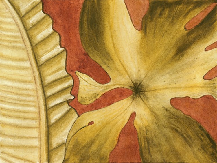
Virginia Creeper
Here is the beginnings of a Virginia Creeper study. I have moved back to Winsor and Newton paints, seemingly a whole new experience after some time with Rublev and limited palette. I found that a mix on Winsor Red and Cadmium Orange brought me in close to leaf color. Also New Gamboge for leaf underlay and probably washes in the future, and Permanent Alizaron Crimson for petiole and main veining.
My model is a few-day old pressing that is losing color rapidly, even though I keep it protected from light when not in use. I'll most likely pick fresh samples as I continue this study.
The brushes in this image are quite my favorites, Raphael 8408 in #4 and #6. I find that I can do fairly fine work as long as they are not too saturated. My W&N Series 7 #6 doesn't come close to fine tipping as these Raphaels, but to be fair, these are the fine tipped line. Raphael makes a series 8404 with "regular tips" and I suspect that they are closer to the W&N Series 7. I do have smaller W&Ns (#4 on down to 00) and really should try them out for fine work. Simulateously, I am tempted to simply fill out the Raphaels on both sides...

Monday, September 27, 2010
Red Oak Wrap
I spent some time late last night and a bit more tonight to tighten up the veining and warm the greens with a lemon ochre wash. This leaf is from the tree that hangs over my deck. Acorns have been hammering down for days now. And it's not only the reds--the white oak across the way is blanketing the road with its nuts.


Sunday, September 26, 2010
Red Oak
Here is a start on a red oak leaf using Rublev colors--Celadonite, Lemon Ochre, Burnt Umber, and Vine Black. I am working on leaving openings for veining.


Saturday, September 25, 2010
New Mineral Paints
My Natural Pigments order arrived today! Here's a quick look at the minerals...
The ochers are of smooth consistency, without apparent granulation. The Celadonite was surprisingly green--I expected lighter value and less saturation. The hematite is described as a brown violet and does display reduced saturation; it also seems to have a bit of a red component that settles out. (You may notice that duality with a larger view by clicking on the image). Last, but certainly not least, is Lazurite. A very pure blue with high granulation. I glazed over the other test strips with a light wash. Fascinating, isn't this--materials straight from the earth?

I usually recognize the change of seasons but the recent autumnal equinox slipped by unnoticed. So here it is, Happy Fall! :-)
Friday, September 24, 2010

Thursday, September 23, 2010
Additions for the Library

Here is my introductory title into oils. I am still teasing about the idea of trying my hand with this medium. In the meantime, I will simply collect a few more fascinating reads. Does anyone have any oils favorites?

A probably long overdue addition, I understand that this is the bible.
Wednesday, September 22, 2010
Cloudy Experiments
I have this lovely mental image of rich and stormy clouds with a setting sun burning through, all this taking place on the lake. Well, there's imagery, and then there's execution... :-)

But the real intent any way was to explore what happens to grays juxtaposed with orange, using that same limited palette. Well, maybe those grays pull a bit towards blue but I expected stronger results. I'm going to sleep on this...


But the real intent any way was to explore what happens to grays juxtaposed with orange, using that same limited palette. Well, maybe those grays pull a bit towards blue but I expected stronger results. I'm going to sleep on this...

Tuesday, September 21, 2010
Limited Palette Wrap
Well, that's a wrap. I pushed some "greens" nearly into black in an effort to open up tonal range. I gained insight on how to work only a few pigments for color and value. There is more to come with this trio. :-)

Monday, September 20, 2010
Zorn Palette
My recent palette is very close to the Zorn Palette of Yellow Ochre, Cadmium Red Medium (originally vermillion), Ivory Black plus White--in oil, that is. Perhaps sometime I can gain an introduction to oils with such a palette. I'm a bit tuckered out this evening so there probably won't be any work on the painting. More tomorrow on that.
But before leaving this subject... It seems that color can be drawn out by working against the complementary. My painting red background seems to open up the greens (see Gretchen's comment from my previous post for affirmation). I found an example where the artist used an orange of Yellow Ochre and Cad Red Light against a medium black (gray) that looked absolutely blue. Of course, every example I find does use oils and the mixing with white seems to offer many more color opportunities.
Oh, if anyone is interested... Natural Pigments (NP) is changing the packaging of their watercolor tubes and offering all in stock 20ml tubes at 50% off. This promotional code--wc50off--is good for ten days. I can't see that this offer is stated on their website. I found out through their newsletter and tweet and would be glad to forward it along. I just retweeted it for my followers. My very first retweet! (Retweet...sounds like Elmer Fudd in a losing battle.)
Here's my order. Prices listed are full price. I've been considering ordering some of these pigments for my own paint making and this is a great opportunity to easily sample at a good price.
Item 1
Product ID: 850-207
Product Name: Celadonite (Green Earth)
Product Price: $12.95
Quantity: 1
Item 2
Product ID: 850-103
Product Name: Lazurite (Lapis Lazuli)
Product Price: $28.50
Quantity: 1
Item 3
Product ID: 850-306
Product Name: Lemon Ocher
Product Price: $8.95
Quantity: 1
Item 4
Product ID: 850-204
Product Name: Malachite
Product Price: $18.95
Quantity: 1
Item 5
Product ID: 850-401
Product Name: Orange Ocher
Product Price: $8.95
Quantity: 1
Item 6
Product ID: 850-701
Product Name: Violet Hematite
Product Price: $9.95
Quantity: 1
Sunday, September 19, 2010
Limited Palette In Use
Here's a little sequence of today's work using my same limited palette as with yesterday's. This painting is based on a graphite drawing from my first Cornell course. I'm thinking that the Indian Red background creates a scenario that makes the yellow and black look greener. I want to push the tonal range and perhaps get in more colors for detail. What a great feeling to be back with a real painting!


Saturday, September 18, 2010
Limited Palette
After last evening's experiments, I soon knew I had to try a color wheel. It's not as even and balanced as I'd like it to be, as I was discovering more possibilities as I mixed. I am so amazed at the range possible with these three mineral pigments--Indian Red, German Vine Black, and Italian Yellow Earth.


Friday, September 17, 2010
Minerals on Paper
Here's a little illustration of mineral mixes to date--both the Carolina earths and Rublev minerals.
I tried mixing yellow with black, looking for possible greens. Although subdued, I think I got some! I also wanted to try out the charcoal as an alternative to ink washes. And over there to the right, I tried a bit of glazing.

Moving down the paper, there are the Carolinas to the left and a wet in wet with the yellow and black in the middle. Wrapping up is some Rublev Indian Red with black--I was trying to pull in some violets. Well maybe, with a bit of imagination. ;-)
You know, it was such a cool feeling squeezing out bits of yellow and black, appreciating the downright perfect degree of wetness with a finely smooth consistency. I've been perusing the Natural Pigments catalog, making tentative pigment selections and eyeing the empty pans for filling and a palette case to hold them.
Thursday, September 16, 2010
Loose Ends
I'd like to cover a couple of items that have achieved prominence around here.
Last week my desktop machine went from the occasional blue screen to completely silent. A few days and few hundred dollars later, the beast was back up with a new motherboard and microprocessor. I realized during that time that my disaster recovery plan was weak at best. Last night my new 2 terabyte external drive came online to backup all my digital work. I'm reviewing all my software for graphics and music production, both for the latest versions and Mac compatibility. I plan to abandon the world of the PC, starting out with a beautiful 27" iMac. The 2TB drive will line up perfectly with the iMac's storage. Adobe will let me flip operating systems at no charge and my music software is usually supplied with both OS's. I figure that I can transition at my own pace with no downtime.
Paint making is so fascinating! I'm beginning to collect documentation and hope to learn and present a good deal more. I recently emailed with Nancy Jackson who authored a couple of great starter documents (here and here) for the Natural Pigments(NP) online library. I'm soon to be an active poster on the NP Watercolor forum. Nancy still mixes her own paints but no longer collects her own minerals. Check out her most beautiful tapestry work. Something I have long realized now is that artists are the most wonderful people--so full of sharing,encouragement, and kindness.
So that's where I'm at in the short run, but soon I know I'll have the itch for pencil and brush. :-)
Wednesday, September 15, 2010
Rublev German Vine Black
This evening I made up my second Rublev pigment, the German Vine Black.
Rublev German Vine Black from John Perry on Vimeo.
Rublev German Vine Black from John Perry on Vimeo.
Tuesday, September 14, 2010
Another Mineral Sample
This evening I made up another little sample, which I'm beginning to see is a reasonable approach. You see, as I grind these minerals, color seems to slide off into more subdued tones. It seems that larger particles may hold color better.

Here are my first tests together for comparison. I'll be putting out more samples, experimenting with particle size as I go along.


Here are my first tests together for comparison. I'll be putting out more samples, experimenting with particle size as I go along.

Monday, September 13, 2010
Working With a Red Mineral
This evening I tried a new attack upon the Carolina earths. First came a bout with mortar and pestle.

With light grinding, the chunks broke easily into smaller sizes.

And after a good deal of grinding, a rather powdery grind was achieved.

Once I began mulling, the familiar sound and feel of grinding particles told me that I was still dealing with too large of a particle size.

Continued mulling did seem to achieve a smoothness so I went ahead with gum arabic, albeit a bit too much that left a rather soupy mix.

Some test patches illustrate that particle size can be detected on the paper.

And because I have been spending all my time in the dirt and away from the brush, I felt a quick sketch was in order, that is, using last night's and this evening's work.

Sunday, September 12, 2010
Earth Particle Sizing
I tucked the bowl of wet Carolina earth into a warm oven for a good overnight drying. You see, after all the mulling of that earth, the texture still felt too gritty. So out I went on the deck with mortar and pestle in an attempt to reach a finer grind. A couple of hours later, I set up my tools with the intent of making paint.

After mulling a bit of earth and adding gum arabic, I arrived at a texture close to that reached with Natural Pigments earth, but still a bit gritty. I decided to stop mulling and fall back to another round with the mortar and pestle. It was my first time with this tool and I did spend an hour chatting on the phone with dear friends while working away. I might have missed some good grinding in all the talk and laughter. :-)

Here is a little comparison of Carolina on the left and last night's Italian Yellow Earth on the right. It's difficult to see here but there are larger grits mixed in with the Carolina paint.

I think that mortar and pestle work is useful, and probably necessary, prior to mulling. This is based on my understanding that mulling separates particles clumped together but does not reduce individual particle size--mortar and pestle reduce particle size. I am coming to appreciate whatever mechanical means pigment manufacturers use to produce such wonderfully powdered material. :-)
Saturday, September 11, 2010
My First Tube
This afternoon I tried my hand at mixing watercolor paint.
Rublev Italian Yellow Earth from John Perry on Vimeo.
It's a bit difficult to estimate costs as quantity pricing can provide good savings; I'll base costs upon the small packaging I dealt with in my kit.
$3.00 One ounce jar of Italian Yellow Earth
$0.90 20ml Lacquered Tube
$0.50 Watercolor Medium
--------------------------------------------
$4.40 Total
$8.95 for a 20ml tube of Italian Yellow Earth

If you are interested in the materials and process, order a free Natural Pigments catalog. Pigments, paints, binders, gilding supplies...
Friday, September 10, 2010
Mineral Play
The very start of Chapter 3, Pigments, in The Materials and Techniques of Medieval Painting, describes methods of cleaning impurities and sizing pigment particles. Firstly, floating organic material such as peat, humus, and roots is skimmed off.

After a skimming, I dug around, grinding up little bits of minerals as best I could.

I then went after the larger particles that wouldn't break down. There wasn't much of that material so I think I will simply toss it.

And here's this evening's final product. It is still a wide-ranging mix of particle size. Perhaps it's too soon to be sure but it seems like the smaller particle sizes present the richest color. I'm thinking that the next step is to test whether this material can be reduced by mulling or if mortar and pestle is needed.

I hold such a feeling of history and tradition while playing in my red mud. I'm now heading over to this inspiring virtual tour for another visit.
Thursday, September 9, 2010
Now With Ink and Watercolor
I wrap up the crabapple leaves with an ink and watercolor version. It felt good to return to the brush.


Wednesday, September 8, 2010
New Books
I dream of the day when I have lots of time to spend with my ever growing library. Until then, I'll collect blissfully. :-)

Recommended reading from the Natural Pigments documentation, I initially targeted the gum arabic information and then started from the beginning. Only four chapters-- Carriers and Grounds, Binding Media, Pigments, Metals--but so full of richness.

I love a good find. I picked this up brand new for less that other used copies! It's another great read, especially for this beginner. This is one of the few of my books that gives examples of drawing mistakes and their correction, and this is the only book devoted to "problems and solutions."

Recommended reading from the Natural Pigments documentation, I initially targeted the gum arabic information and then started from the beginning. Only four chapters-- Carriers and Grounds, Binding Media, Pigments, Metals--but so full of richness.
I love a good find. I picked this up brand new for less that other used copies! It's another great read, especially for this beginner. This is one of the few of my books that gives examples of drawing mistakes and their correction, and this is the only book devoted to "problems and solutions."
Tuesday, September 7, 2010
Colored Pencil Values
Here's a little chart where I began by pressing very hard and progressively easing off. The b/w image below illustrates the range of possible values for each pencil. This is not really a surprise but seeing the real thing rather than relying on a conceptual model firms up the idea.


Around The Lake
It's not been that often that I get out around the lake, but today I made my way out for leaf collection and photos. I have supply of leaves flattening and drying in a Moleskine with supporting reference photos. It feels like a pre-winter harvest, even thought summer is still in the air.


Monday, September 6, 2010
Crabapple and Colored Pencil Continued
Here is one of a few dried leaves I picked from my crabapple tree. Lots of colors used, from yellow, orange, red, browns, and a it of green. I found Dark Indigo #157 pleasing for shadows.

I have only twenty pencils, the ones recommended in Wendy Hollender's books, so it took a bit of mixing to get the range of color. Earlier today I read in her more recent book that she finds that beginners often lose form achieved with tonal range as they get overwhelmed with color. I can certainly validate by this desaturated copy of the image above. I'm thinking that by achieving a wide tonal range with color that I can get my images to pop.

Here is yesterday's sketch in b/w, perhaps a bit more contrast that today's.

Sunday, September 5, 2010
Colored Pencil Practice
A while back I tooled up with colored pencils but quickly moved on. Here's Friday night's sketch with Polychromos. I spent about three hours here, experimenting with blending and then burnishing with Ivory.


Saturday, September 4, 2010
Preparing Glass Plate For Mulling
It's movie night! Email subscribers, you may need to visit the blog to pick up a link to the movie.
Preparing Glass Surface For Mulling from John Perry on Vimeo.
Friday, September 3, 2010
Crabapple Leaves Sketch
I didn't want to take this too far, fearing that I might botch it up. But I think it'd be fun to transfer this to watercolor paper, perhaps with an ink border and some colored washes.

Here's how I set up my model.


Here's how I set up my model.

Subscribe to:
Posts (Atom)