Friday, September 30, 2011

The Art Experience

Today I visited my first real art store. I've been planning a side visit to DickBlick in Boston when I get back to the MFA. But  in need of a few things for next week's class, I dropped in at The Art Experience in Avon. Wow! I got most of what I needed and only splurged a bit. Being able to see and feel all those papers let me home right in on a Canson vellum bristol--a bit of tooth but still pretty smooth. 

This place has all kinds of panels suitable for gesso--masonite, wood, and wood with supports. Very cool.

I'm off to try my new paper. Having hurt my back, the only place I can get comfortable is in bed with a heating pad. I'll be juggling all my stuff and hollies while keeping Timothy at bay!

Thursday, September 29, 2011

Winterberry

As the theme of our classwork has been Holly species (Ilex), Sarah assigned an extra credit homework assignment to find the deciduous holly, Winterberry, Ilex verticillata. That's easy here--there are tow Nuncketest posts and it grows in my swamp back yard. So rather than begin my holly assignments, I tried a sketch of Winterberry to warm me up. It's really been a long time since I've used my pencils.

Winterberry
Ilex verticillata

Wednesday, September 28, 2011

Full Circle

Nearly two years ago I picked up a pencil and what a fun ride it's been! Back then I wanted to take up a class with the Friends of Wellesley College but the annual entry had recently gone by. Now I have that opportunity!

We're working on three species of holly--a line drawing of a branch and a tonal study of an individual leaf.

My Strathmore paper proved to be a bit bumpy for fine detail so that's being replaced with Stonehenge or Canson. I'm working on catching up with last week's work and homework and completing this week's.

There will be occasional posts each week on this class. I'll get into the details of class instructions and my work.

Japanese Holly
Ilex crenata

The sketch above seems rather light because it's in the "roughing in" stage. Once I'm sure that the positioning and shapes are accurate, I will darken in while adding leaf serrations. The lightness of my pencil strokes at this time are important--they can easily be erased.

Tuesday, September 27, 2011

Retracing My Steps

As soon as I peeled the masking off last night I knew the  frame was too cool and dark. Today on the road for a few hours I saw stone everywhere, and most of it was of lighter values than my work. I noticed a lot of warm colors too.

Tonight's work is a bit too pink but I think I'm working into better hues. Next up is to lightly incise any edges, mask with acetate so the leaf shows through, and then blast the entire frame in one operation. Later I can work in overall shading and bevel details.


Tomorrow I begin my first in person botanical art class! Actually, this would have been my second weekly class... Somehow or other I botched up the schedule. Is this what happens when one retires? :-)

Monday, September 26, 2011

Stone Starter

Here's a start on the stone, with a couple of lessons learned:

  • Don't place masking tape on egg tempera--it dulls the surface. I may need to redo the front-facing surfaces. 
  • Keep the razor knife away from the board. I actually cut through the gesso and created some chipping. Trying to fill in with white.

I like the reflected light look on the bottom rail and want to apply that to the right side. I think that might pull the leaves and frame closer together.

Will there be a background? Hmm...


(If the frame looks ever so slightly twisted, it's because my scan was a bit off.)

Sunday, September 25, 2011

Stonework Begins

It won't look like much for a while but there's already a good bit of work here, measuring and masking. Next I sponged in a starter layer of vine black and titanium white. The poison ivy is masked out with a sheet of heavy paper as there will be some serious toothbrush splattering coming up.

Next up is to tape over the bevels and finish the front facing surfaces. Then a flip of the masking to the front surfaces as the bevels are finished.


I'm planning to simulate carved lettering into the bottom surface in one line: Leaflets three, let them be.
Font design and placement will take some time.

Once this is complete, I will return to the poison ivy for wrap up. That's the plan! :-)

Saturday, September 24, 2011

Dry Brushing Technique

This evening rather than glazing per se I applied thin layers with a dry try technique. I found that I had to get the brush nearly void of paint like I do when glazing. I could drop in details with concentrated paint and strong glazes with slightly watered down paint. I think I'm catching on to the balance between glazing and stronger applications--they both have a place.

This might appear obvious, as it now does to me, but it's something that I seem to have overlooked.

Friday, September 23, 2011

Stepping Stones

Koo Schadler's "Old Masters Design" workshop has sparked me into Renaissance studies. I am knowing less and less each day. Lucky for me, my town's library budget is finally on the mend, with hours expanding considerably just as I left work.

Raphael is a wonderful picture book. I'm on the lookout for a used copy as I'd like to try at least portions of a few paintings.


"Poison" was a great read, light on Renaissance but heavy on religion, poison, and intrigue.


The BBC's "Renaissance" is tough going for this easily distracted mind and I might not make it through because...


this arrived today. The Kindle sample proved fascinating but the images were poor at best. The book itself has rich images on heavy semi-gloss stock. It's a beautiful book.

Thursday, September 22, 2011

My Easel Setup

I thought I'd show off my new setup. That's my iPad on the left, strapped in with its shoulder harness. ;-) A couple of strips of artist tape keep it from sliding off the ledge. I can gesture the surface and kick up the image size too. This setup works really well for a guy and his bifocals!

Of course, working from life is the way to go. I wish I'd been able to better light this subject but I was boxed in by the roadway and without gloves and proper packaging so I wasn't taking this specimen home.


From this side by side comparison, it's easy to see that I need to warm up the subject considerably. That's for tonight's work.

Wednesday, September 21, 2011

Glazing Away

In the spirit of glazing I spent a few hours this evening building color and form. There's an art to understatement, to using very light glazes and holding a cautious eye. It's easy to get carried away and push just a bit too far. Once all these layers set up, perhaps a light scumble with white to pull in some of those dark greens.


Tuesday, September 20, 2011

Mix or Glaze?

I'm usually a daily poster but yesterday was one of those days--flat tire, cat sitting for the neighbor getting a new hip, and rescuing my sister from the airport. Airlines (initials are United Airlines) that overbook suck.

What began as an experiment in glazing various earths against green earth quickly turned to an obscene mess of a chart and already in the rubbish. Okay, that's what learning is all about. I gain most from my mistakes.

So rather than glaze I decided to push the blueish leaning green earth around, mixing with a yellow and a red ochre. Obviously there weren't  going to be any high chroma colors but how many greens really are that screamingly intense green any way?

With yellow, the greens pulled nicely warm. Same for the red.

Now to the question that's been gnawing at me for some time. Mixing versus glazing. Egg tempera is about glazing. It loves to be glazed. Twenty (or forty for that matter) layers a day is easy. It hums with depth and luminance. Can I get the same color in glazes that I can in mixes? And vice versa?

The first two rows of stripes are mixes. Just quick mixes: top with yellow; next with red. I left out plenty of gradation. The last row is glazed. Gradated yellow or red. As I glazed along I occasionally dropped on another layer of green earth. There are something like twenty layers at the top of each stripe. (The stripe in the middle is the pure green earth control.)

I guess I've always gone on the assumption that mix and glaze can provide the same result, at least as far as base color is concerned. And, I think there's a fine richness that achieved only with glazes. I wonder... Would there ever be occasions when I wouldn't be able to mix or glaze to achieve the same base color? Is it dependent on the medium?

Sunday, September 18, 2011

Earths Color Chart

It's simply amazing the colors available from natural earth pigments. I tried to match up values to my Munsell chips by mixing the pigments with titanium white. My favorite colors are the top row delicate pastels and the bottom swatches as they are clear pigment and offers some degree of transparency. The middle tones have a slight chalkiness that might lend well to peach fuzz or plum bloom.

As I work these exercises I wonder how often I might mix white heavily. I suppose it could be frequent if I was looking for a very specific look but even then I expect that I'd be glazing to add depth and luminosity.

This work is only in part about Munsell and really more about just taking the time to play with and explore my pigments.


Saturday, September 17, 2011

Thoughts on making charts

I began with the intent of copying the Munsell 5YR chart in egg tempera but soon realized that I didn't have enough familiarity with my pigments. So for a starter exercise I simply cut loose and played with a few pigments that I thought might get me close.

The Cyprian umber seemed to be outside the hue family but the English sienna and Type B umber came in with a few colors from the chart. I thought that I could run through adding more white to a pigment and see it walk up the value scale while holding chroma. Not so with these pigments, and I find this fascinating!

I want to retry this study with the same pigments only now working strictly with the Munsell neutral values as value guides and see how the pigments then perform. The initial pigments will take time but I suspect this will get easier as I gain experience.

There might be two approaches--mixed with white, or straight pigment(either layered or different strengths).  Note the last column where I layered pigment instead of mixing white, preserving transparency.


Friday, September 16, 2011

Munsel Student Charts

An exercise of Chapter 1 of the Munsell Student Color Set is to break down the little packets of color chips, one packet for each hue page. They are then arranged in place, labeled on the back, and glue sticked in place. After the first few charts, the sorting became considerably easier as I picked up an eye for chroma and value.

These charts will get plenty of use in the upcoming exercises.


Thursday, September 15, 2011

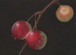
Crabapples Redux

Following encouragement from Dorothy on my crabapples painting, I've put in some effort the past two evenings. There's more work ahead but I'm liking where this is going.

Wednesday, September 14, 2011

More Ivy Work

I got in some work on this last night and again this evening.


More munsell coming soon. I am assembling color charts. Three down, seven to go.

Tuesday, September 13, 2011

Poison Ivy

I've been wanting to try out poison ivy for some time so last night and into the wee hours of the morning I began this test piece. I'm practicing brush control with light washes while experimenting with complementary layers.

Monday, September 12, 2011

Nature Walk

Leaflets three,
Let them be.

Virginia Meadow Beauty with pods.

Goldenrod with visitor.

Sunday, September 11, 2011

Neutral Refinements

Yesterday we saw how the yellow of the yolk fades quickly. I think it's still fading, becoming whiter! Later this evening I'll paint up another white chip for a three day comparison. I think I've read that fading does occur over a few days--wish I could find that reference.

Gretchen asked if I compensate for the inevitable whitening of egg yolk yellow. At this time, I haven't tried. I think this will only become clear when I can accurately mix a Munsell neutral and then see if it holds. Granted, in white the yellow is obvious. As the value decreases, will the yellow be as prominent? How about when I begin introducing color? I think only by experience will I be able to answer these questions. (Note: The Munsell kit call for using acrylics for these exercises. I decided to use egg tempera to challenge myself and become more familiar with my medium. Also note: the rational painting recommendation below for burnt umber is based on oils.)

Although it doesn't present properly, the Munsell chip is actually a darker value than my first painted chip. You see, the Munsell chip is N9/, a value of 9. Munsell values theoretically go to 10. Titanium white can present as high as 9.75 and I am certainly seeing a lot brighter white than that N9/ chip. I forgot all about this and somehow associated pure titanium white with N9/. What this means is that I must tone down the pure white for the true value of 9.
Early this morning I finally arrived at a hue close to neutral! The Munsell Student manual suggests using either cadmium red or yellow to warm up a hue or cerulean or phthalo blue to cool it down. Well, I just couldn't seem to pull my hues to neutral until I remembered another source mentioning to use burnt umber. That works pretty well!

On my lower set of chips above, the chip on the left is the bluish hue I was trying to neutralize. That's the Munsell chip in the middle. On the right is my mix with burnt umber, the bottom part of that chip with slightly more umber than the top. See how it's pulling in closer in hue? The value still needs work, though.

I found this method on rational painting.org where Graydon Parrish recommends mixing the proper value using black and white and doing the same with burnt umber and white. Then with both mixes at the same value, mix them to achieve an exact neutral. The thought is that one must deal with only one property (hue, value, chroma) at a time.

So you can see that I have some work ahead of me. And yet, I've already learned a lot and starting to pick up an eye for real neutrals. I'll be working on my neutrals while forging ahead on the remaining exercises in Chapter 1.

Saturday, September 10, 2011

Munsell Neutral Value Scale

The second Munsell exercise calls for creating value chips using the student kit's chips. In the image below the Munsell chips are upon my own painted in egg tempera on Bristol Board using natural black oxide and titanium white. Some chips I hit pretty close; others need work. Also, notice the mid values, how my paint leans to the blue. (I'm working that out now.)


Exercise 1.2

Inevitably when I describe what egg tempera is all about, the question of the yellow of the yolk comes up. Doesn't it color my paints? Usually, it seems not very noticeable at all. Pigment colors hide any yellow and often the paint is quite diluted.

But white is another story! Can you see the slight yellowing of the chip on the left? I painted that just an hour ago. The one on the right was painted last night. This is a great example of how any yellowing does indeed fade out quickly.
Titanium White
Fresh                             One Day Old

Friday, September 9, 2011

Munsell Intro

I'm working with "The New Munsell Student Color Set, 3rd Edition". Each chapter has a series of exercises that I'll blog on as I work my way through.

Chapter 1 is all about the vocabulary of the Munsell system. Rather than trying to present information that is already so well documented, please Google "Munsell" for details.  This one in particularly is spot on.

Exercise 1.1 is rather simple. Break apart a packet of colored squares, determine where to place each, mark the back and glue stick in place. Well maybe not that simple. It is a good introduction to the Munsell properties: Hue, Value, and Chroma. HVC.

Exercise 1.1

Thursday, September 8, 2011

Bringing It Back

I felt a bit of regret after blasting this painting into darkness, but although I did like the delicate look I still wanted to push the tonal range. This evening I'm working on bringing it back and I'm starting to get comfortable with this new look.


Today I signed up for a botanical art course! The Friends of Horticulture on the Wellesley College campus hosts a whole botanical certificate program as well as a bunch of fascinating workshops. Read all about the curriculum here.

I'll be taking this entry level course:
Foundations of Botanical Drawing and Painting

Learn the basics of botanical art with our lead instructor and Education Director, Sarah Roche. Under her guidance, realistically render botanical forms in pencil and watercolor. Through demonstrations and tutorials Sarah will introduce you to the traditional art and science of botanical drawing and painting. Instructional focus includes observational skills, drawing, composition, design, and watercolor techniques.
My interest in art came about through botanical. These days I am not sure where I am going or even which media I  might settle on. Yep, I'm confused. I figure that I will simply explore everything I want and see where this all leads me. I'd like to feel that I have solid direction but it's just not there at this time.

But in the meantime, I am so lucky to be studying with Sarah Roche. Check out her website here. And also very lucky to be tied with NESBA and their incredible talent--I'm humbled and motivated.

And speaking of exploration, more on Munsell soon! :-)

Wednesday, September 7, 2011

A Different Look

The background is developing. I dropped in the illusion of leaves and then overlaid many layers of various pigments. On the last layers using dioxazine violet I also went over portions of the two front fruit for some shadowing. Next I will go back it and redevelop detail and highlighting. I want to work on soft and hard edges weaving in and out.


On another note, I'm starting a new project! The New Munsell Student Color Set, 3rd Edition arrived today. I will be working through the exercises, blogging as I go. More later.

Tuesday, September 6, 2011

Bits and Pieces


I picked up an iPad today. I already know that I'm really going to like this! My workmates sent me off with a great retirement party and an Apple card that sure softened the purchase price.


Here's a game to try. Can you get a zero? This is a segue into a new interest. More on this tomorrow!


Lastly, I've been looking into linen to cover birch plywood as I consider making my own gesso panels. Here's a linen that's been recommended by the folks over at fabric-store.com.

Monday, September 5, 2011

More Crabapple

Here's a start on a background. The gold ochre is not quite so yellow here but it'll be changing any way, to what I'm not sure. Smoothed out the shadowing and added highlights and reflected light. I'm taking a break now before developing the light. First I must decide on the background.


Sunday, September 4, 2011

Crabapple cont

Building up color and form. Overdid the shadowing a bit with prussian blue glazes--hoping to pull it back with some white stumbles and red glazes. There's just a bit of highlighting at this time. I'm having a good time with this piece.


Saturday, September 3, 2011

Crabapple


Rather than continuing with the Buckthorn, I'm turning to a crabapple setup. I feel that I pushed intensely dark values too quickly and also had a lot of trouble with layer lifting.

So here I am trying a larger image (6x8") and working with subtle values. And most importantly, I am working hard to hide brushstrokes. There is some blotchiness but I'm learning to stay out of trouble. Patience and attentiveness are key.


Friday, September 2, 2011

Buckthorn

It was a fine day for a walk about the lake. Got a few pictures of buckthorn and a pocket sample. I like the chewed up dancing leaves.  Just hope I can do them justice.


Thursday, September 1, 2011

Alizarin Crimson Substitute

After recent discussions with a talented artist regarding the lightfastness of alizarin crimson, I've started poking around for a substitute. Irgazine Ruby DPP (Diketo-pyrrolo-pyrol) seemed a likely candidate. Kremer rates it top of the scales for lightfastness.

The dry pigments clearly show differences but I've learned not to put much stock in dry appearances. All images are with Irgazine Ruby (PR264) on the left; Alizarin Crimson (PR83) on the right.

PR264                  PR83
Dry Pigments

Although blurry, I think when the autofocus got confused with the glass palette, the colors seem closer.

Pigments mixed with egg medium

Here the colors seem to veer off with the PR83 leaning a bit towards blue. Still, seems pretty close.

Test strip.
Mixed pigments diluted with water
on the top half and titanium white below.
I'm reading about PV19, a quinacridone, as another possible substitute. There are two colors, leaning either towards red or blue, with this same pigment code. More on all this later. I just felt the need to try out a little test here with in stock pigments.