Friday, April 30, 2010

Mixing Exercise 14

Exercise 14 - Grays and neutrals from yellow and violet with orange-yellow and mixed bright violet. Cadmium Yellow, French Ultramarine, and Permanent Rose.


This is my first three pigment mixing exercise. Firstly, I've learned to tuck aside enough starter mix for each column. Towards the end I ran a bit shy and had to start with a less that fully saturated mix. I like the browns, especially when they turn slightly violet.

These exercises are leaving their mark on me. I'm beginning to categorize colors--this red is leaning towards orange, that green is leaning towards yellow, that gray is mildly saturated blue... Sometimes I just stop and gaze at the foliage...

I particularly enjoyed the results on my mixing palette although I'm really not capturing in this image the lovely range of colors. This example got me thinking of perhaps how to establish a working palette for a real painting.

Thursday, April 29, 2010

Mixing Exercise 9

Exercise 9 - Finding a little extra green with green-yellow and green-blue. Winsor Lemon and Winsor Blue GS.


Holy guacamole! This blue is intense! Thanks go to Gretchen and Katharine for encouraging me to give this pigment a try. :-)

Tomorrow will bring the first of the three pigment mixes.

Wednesday, April 28, 2010

Mixing Exercise 13

Exercise 13 - Bright oranges with orange-yellow and orange-red. Cadmium Yellow and Cadmium Scarlet.

Nice clean, bright oranges, eh? Of course, the same principle we use here applied when mixing bright violets and bright greens. Start with pigments leaning towards the target color and it'll come up quite pure. Want less saturated secondaries? Use one or both pigments leaning away from the target color.

I still had a bit of trouble making progressive mixes but taking my time and adding just a bit at a time helped somewhat. Maybe this is all just a matter of practice...

Next up is a series of mixes with three pigments. (There's still a two pigment exercise coming up--that is, once the pthalo blue arrives.) I'll be using two primaries to make a secondary and then mixing that with its complement. Now how cool is that? :-)

Tuesday, April 27, 2010

Mixing Exercise 12

Exercise 12 - Mid-oranges with green-yellow and orange-red. Winsor Lemon and Cadmium Scarlet.


I think did a bit better this time graduating out the oranges but I didn't find it easy. I'm wondering if my lighting might be part of the problem. I'm working with overhead fluorescents and a small desk lamp with a so called daylight incandescent lamp. At some point, I'd like to pick up some true full spectrum lighting, just to take this possible issue off the table. But first, I'm trying to plow through this document.

Monday, April 26, 2010

Mixing Exercise 11

Exercise 11 - Mid-oranges with orange-yellow and violet-red. Cadmium Yellow and Permanent Rose.


I think these orange exercises are a bit skewed by the W&N Cadmium Yellow. The tube lists only PO20. The W&N website lists PO20 and PY35. W&N Cadmium Yellow Light (the pigment I should be using) is listed as PY35. So, it seems that my Cad Yellow is actually a mix of Cad Orange and Cad Yellow Light. Hmm...I am mixing with a mix... This does gnaw at my perfectionist tendencies but I'll just keep mixing away here, knowing that my yellow is a bit overextended into the orange camp.

Curiously, W&N's Cadmium Orange is a mix of PR108 (Cadmium Red) and good old PY35. Another mix! So how come they mix in Cad Orange to make Cad Yellow and don't use any Cad Orange to make Cad Orange? I think this is a good question so I have posted it off to Winsor and Newton technical inquiries.

Sunday, April 25, 2010

Mixing Exercise 10

Exercise 10 - Grayed oranges with green-yellow and violet-red. Winsor Lemon and Permanent Rose.


Well. I know this is supposed to be a grayed oranges exercise but, really, they sure look bright enough to me. Okay, so maybe the bright series will be brilliant oranges. I tripped a bit between columns three and four, as I probably could have squeezed in a couple more mixes, but these pigments were so lively.

Perhaps one must also take into account the tonal ranges of the pigments. Lighter must translate a bit to brighter. Ah, to properly account for the pigment and resulting mix properties of hue, chroma, and value. More to keep in mind.

I'm off for special binders with transparent sleeves to keep my work clean and in order. I can appreciate as I parse through my exercises how my nuanced mixes have improved. I made a change today that helped by switching from my Raphael 8408 #6 to a #3. I'm finding that the 3 holds a load that more closely fits with a square meaning less wicking off and more control. But, I do love the 6--it actually seems to tip off better than the 3. I guess each brush is truly unique.

Saturday, April 24, 2010

Mixing Exercise 8

Exercise 8 - Bright greens with green-yellow and green-blue. Winsor Lemon and Cerulean Blue.

Interesting how these greens are so bright. As these exercises go on I'm gaining a bit of comfort with where pigments are positioned in the color spectrum. Exercise 9 call for replacing the Cerulean Blue with Phthalocyanine Blue with the expectation of even brighter greens. Well, out of all my tubes of paint, I don't have this pigment so I'll simply pass on this exercise. Next up, Exercise 10 will be grayed oranges.

Friday, April 23, 2010

Mixing Exercise 7

Exercise 7 - Mid-intensity greens with orange-yellow and green-blue. Cadmium Yellow and Cerulean Blue.


Tomorrow we wrap up the green with the brilliant set! :-)

Thursday, April 22, 2010

Mixing Exercise 6

Exercise 6 - Mid-intensity greens with green-yellow and violet-blue. Winsor Lemon and French Ultramarine.


I feel like I'm gaining a gentleness about mixing--using less paint, less water, unloading the brush on my towel as needed. I am beginning to feel how little of a mixed in pigment is needed to make a change.

I'm seeing color. Sometimes I see ultramarine or cerulean or something close to that. But what I am most noticing is that there are so many colors. Subtle differences are coming to life for me. Just barely registering is the thought that I may try to replicate these nuanced tonal hues.

Wednesday, April 21, 2010

Mixing Exercise 5

A link to my botanical illustration course posts is now featured on Cornell's registration page . Included is one of my drawings, my favorite submission. I will soon be signing up for the watercolor course starting on June 7 and will naturally be blogging it all out right here! :-)

Exercise 5 - Grayed greens with orange-yellow and violet-blue. Cadmium Yellow and French Ultramarine.


It is suggested that one think about where each mix might be used so I'm thinking mostly about botanical style paintings. The violets, well, I thought of rhododendron and azalea flowers. Violets and pansies too. These greens and blues, so many possibilities... Foliage. Perhaps shadows. It seems to me that there is an incredibly rich range with these two pigments.

Tuesday, April 20, 2010

Mixing Exercise 4

Exercise 4 - Bright violets with violet-red and violet-blue. Permanent Rose and French Ultramarine.

Well, this exercise is somewhat more vibrant that Exercise 3 but to me not exceedingly so. There are some new colors here and in particular I like those velvety slightly violet blues (down three, across three, from the upper right corner.)

For the next exercise we start into the greens!

Monday, April 19, 2010

Mixing Exercise 3

Exercise 3 - Mid-intensity violets with violet-red and green-blue. Permanent Rose and Cerulean Blue.


These are two gorgeous colors! And don't they make beautiful children?

Although we're still only dealing with only one pigment leaning to the violet side, these particular pigments left those previous two exercises looking positively blah.

Once again we notice the Cerulean Blue dropping out of mix and collecting in puddles. I don't see this behavior in the book photos and I think it may be that the author's work is on cold-pressed paper. All my work is on hot-pressed. Perhaps the smooth finish of the HP allows for that pigment particle migration whereas the CP allows those particles to settle into the paper's rougher surfaces. You know, like little hills and valleys instead of parking lots.

Flowering Quince and Other Stuff

Just to mix things up a bit. After all, just how many boxes of color can one look at?

The quince flowers began breaking buds last week and are now in full bloom.


Yesterday I headed back to Pier 1 Imports for a couple of these very cool six inch porcelain plates. I'd noticed them a few weeks back but didn't realize at the time just how useful they could become as palettes. Only three bucks each!


And a major discovery this weekend when I finally diagnosed this poor ivy as ridden with spider mites. It's been dropping leaves like crazy (it was so bushy...) and I'm hoping that a good soap and water spraying will stop those bugs in their tracks. I'll keep spraying as I've read there could be eggs hatching soon.


And if that wasn't enough, there was that lovely lunch with that lovelier lady. And then today brunch out with a friend. I never want to go back to work. Alas, tomorrow I will...

Sunday, April 18, 2010

Mixing Exercise 2

Exercise 2 - Mid-intensity violets with orange-red and violet-blue. Cadmium scarlet and French Ultramarine.


Well, I don't see much improvement with these violets, maybe a little with the lighter washes. I'm working a new chart layout that works well with the scanner. Perhaps I could have got in a few more columns. Where I'm having difficulty is detecting the nuances in color while mixing the pure pigments. As the tones lighten out, I see the differences so much more.

So for me, it's not only an exercise in learning about pigment mixes but also the mechanics of mixing. Like how much water to include in the most saturated mix. How to gradually fade. How to mix subtle color differences. It's all practice for me.

Mixing Exercise 1

Exercise 1 - Grayed violets with orange-red and green-blue. That is, Cadmium Scarlet and Cerulean Blue. As expected, violets are quite muted. Moving to the blue side brought up some nice-looking slate colors.


Being my first exercise, its no surprise that I'll be making changes to the chart layout. Most important is to leave a border as my scanner doesn't seem to scan all the way to the edge. The paper fits but that machine doesn't want to go there.

Another thing is that I will try to really take my time on each chart to feel the mixes. I think for my first time through, I had some amorphous goal of quick completion.

The middle mixes with the lightest washes were interesting. While I was laying them down I only saw one color. Upon drying out, it appears that the cerulean blue precipitated out and clumped up as well. (Click on the image for a better view. I will make the images larger on remaining exercises.)

I'll post each exercise upon completion just to keep myself organized. Some days that might mean more that one post. Hopefully today will be one of those days! :-)

Saturday, April 17, 2010

Blue and Yellow Don't Make Green

I recently picked up a copy of this intriguing book by Michael Wilcox upon a recommendation by Katharine. I'd like to spend some time working through the book's exercises and presenting the results here. Now, I know I'm bounding about from subject to subject but what's a newcomer to the world of art to do? Everything is so interesting.

I do want to better understand color mixing and I think this book will help. The book's title may leave one wondering if I'm perhaps off on a bad track but an initial read leaves me thinking...

Here's what I see as the kernel. Mixing pigments does not "create" a new color. The resulting color of a mix is actually a subtraction. For example, when blue and yellow are mixed, the yellow and blue are canceled out leaving available for view any contained green. This premise may not be clear at this time, but as I present out some exercises, we will together see just how well this viewpoint holds water.

Here are the colors we'll be working with:

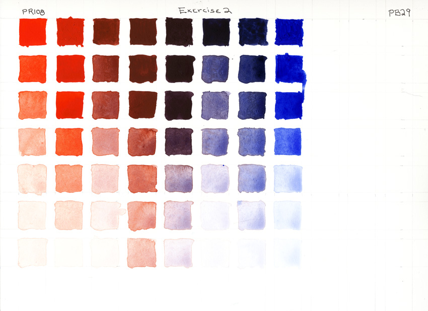
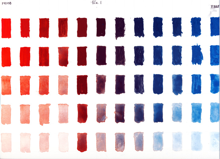
Orange-Red Cadmium Scarlet PR108 (Cadmium Red Light)
Violet-Red Permanent Rose PV19 (Quinacridone Violet)
Violet-Blue French Ultramarine PB29
Green-Blue Cerulean Blue PB35
Green-Yellow Winsor Lemon PY175 (Hansa Yellow)
Orange-Yellow Cadmium Yellow PO20 (Cadmium Yellow Light)

I did make minor replacements from the listed reds and yellows. (The listed colors are in parentheses above.) They are all kinda sorta primaries but none of them would be considered "pure" primaries. Each pigment leans towards one of its adjacent secondaries.

I've penciled in the boxes on a sheet of hot pressed and cleaned off my palette. I'm ready to start in on the first exercise-- grayed violets using orange-red and green-blue. What's important to notice is that neither color has violet in its name.

Okay, this lays in the basics. Now I'm going to get into some color mixing and should be posting color charts tomorrow! :-)

Friday, April 16, 2010

What All The Buzz About Over At Pencil and Leaf?

Well, there's plenty going on over there! My good friend Val Littlewood has been buzzing about for some months now, creating incredibly beautiful illustrations and providing in depth articles on many, many species of bees.

You can check out all her most excellent work over on Pencil and Leaf.

And if that's not enough... Yup, there's more! Check out her upcoming exhibition!


And if even that's not enough... Rumour has it that there's soon to be a stonking bee shoppe where all of Val's incredible work will be up for sale! Of course, it's only a rumour so I wouldn't want it to get around so you do promise not to tell anyone, right? And why am I writing with a bloody accent?

A Closeup on Pens

Here are some closeups of the Rotring 1.9 and the Speedball C-4. That's the Rotring on the left.

The Rotring has a thicker nib and rounds over the top for smooth upstrokes. (This shot is straight on and it may be a bit hard to discern the very tip of the nibs. Do click on the picture for a better view.)


The Rotring has one supply slot while the C-4 has two.


And if you're new to calligraphy, as I am, be sure to check out yesterday's comments--Gretchen and Katharine give out many, many great tips!


Thursday, April 15, 2010

Rotring Calligraphy Pens

A while back I picked up a trio kit of Rotring calligraphy pens. Here's a little test using all three sizes.


The nibs come in widths of 1.1, 1.5, and 1.9 mm and are very well polished. That smoothness allows the nib to be pushed upward without catching. In other words, it's impossible to make these pens splatter.

The kit includes an Arkansas stone and leather pad for adjusting the nibs. The 1.1 nib seems a bit on the thick side so I might try a trim there. Of course, with those polished rounded tips all the nibs leave a wide line. It takes a real dip pen style calligraphy nib to do a fine cutting line.

These pens take an ink cartridge of non-permanent ink although a piston fill converter is available.

I prefer these pens to the felt tips but in the end nothing beats the good old dip pen. Although...I've not yet tried a quill. :-)

Wednesday, April 14, 2010

A Couple of Birds With Color

Well, I'm not sure here... The colors seemed so disassociated that I threw an ochre (gotta love that earth pigment!) wash over the greens and the background. That seemed to help a bit.


What I do like about it is that it got me thinking about color mixing and palettes and value. Not sure right now where it will lead. I'll sleep on it.

Tuesday, April 13, 2010

A Couple of Birds

Well, I'm really not sure what kind of birds these are...


But I do want to get in some nice lively colors, nice and intense...

Monday, April 12, 2010

Springtime Around the Lake


The Cornell webinar went down nicely. I got to speak a bit on the student experience. My drawing instructor, Marcia, and I were guests in a group of instructors learning how to configure and use the Moodle software interface with their own classes. As a systems analyst/developer, I found the discussion and software interesting--thoughts and implementations that I can bring to my own workgroup.

I think the most important point that I made was in regards to the instructor providing a unique and nurturing experience for each student. That is, facing the difficulty of student and instructor realistically feeling and understanding each other with most of our human points of exchange missing (e.g. facial expression, tone and hesitancy of voice, posture...), and all the while keeping the balance of praising work and simultaneously providing challenge. Tough enough in person...


I'm making a little change around here. I've been of the habit to have a post prepared sometime into the evening and schedule it to appear on the next day. Also, FeedBurner email delivery was scheduled to deliver around 9 AM. Instead, I will now let posts appear as they are created. FeedBurner will now deliver around 3 AM local time (EST, -5:00 GMT). Personally, I'd rather have FeedBurner keep an eye out for new work and immediately send it out but this industrious little software needs to work on a schedule.

Step Pattern Complete

There. That's it! I cleaned up some blotches and reinforced all the colors. This image is a good representation of the colors and saturation. If anything, the painting is actually a bit more intense.


Sunday, April 11, 2010

Step Pattern Continued

Getting there... Maybe one more day. About four hours here... Image is a tad more saturated than actual painting.


Saturday, April 10, 2010

Step Pattern - First Color

Here the lines are inked and a light wash applied. I'd lost some alignment during the penciling in of the pattern against the grid. With the ink, I was able to tune in the lines. I felt a lot better about the pattern after that. I'm using a T-square and triangle against a watercolor block that's sometimes a bit shaky. In my technical drawing days forty (yipes!) years ago, my drawing paper was taped to a nice drawing board, a fine and secure arrangement.

About three hours here. Next up is to work some texture in. These are Winsor & Newton watercolors--Yellow Ochre, Burnt Sienna, and Cerulean Blue. This image was from the camera; the scanner made only washouts. More tomorrow! :-)


Friday, April 9, 2010

The Celtic Design Book

What a fun book! :-) Or perhaps better said books, as this was originally published as three separate volumes--A Beginner's Manual, Knotwork, and Illuminated Letters. Written and illustrated by Aidan Meehan.

Here is a "step pattern" from the Book of Lindisfarne. The initial grid layout and penciling in took a couple of hours. Next up is the inking in and for that I'll try to pick up a black 0.25 mm Pigma locally. I'll also be poking around the web hoping to find an image of the original manuscript for realistic coloring. Not doing well there...perhaps this step pattern is a little piece on a page? Perhaps I need to extend my library? :-)


Thursday, April 8, 2010

The Colored Celtic Cat

One thing led to another and three hours later... I tried grounding my palette by mixing most paints with Yellow Ochre and even using it as a pale wash over other colors. That's probably all for this piece--it is really an experiment with knots with stops and ends, as well as a watercolor exercise. I have an idea of using this border style with an illuminated letter and a bit of calligraphy, something with a cat quote. But for now, I will most likely poke around with a selection from The Celtic Design Book by Aidan Meehan.

Wednesday, April 7, 2010

Border Continued

I built upon yesterday's border, learning how to add breaks and ends. I spent hours last night trying to come up with a weaved corner but just couldn't get there on my own and didn't find any examples. I'd been hoping to do up a zoomorphic cat and this seemed like the perfect opportunity. Ain't he cute? :-) It's a trace job, not my own design.

Everything here is lined with the Pigma Micron so I'll have no trouble with watercolor washes. Not sure yet how the color will play out. I have to consider this a test piece as the previous border is on the same page. This could be an interesting piece if it was designed out properly with illuminated letters and calligraphy. Lots of possibilities here...

Tuesday, April 6, 2010

Border Starter

Here's a bit of an experiment. To simplify measurements, I placed alternating marks every 2mm and 4mm, and then drew my guide lines at a 45 degree angle. A T square and triangle made things easy going. Only thing now is that want to get into breaks and corners. For that, I need to fall back to Katharine's web site and my book. So, for now, I'm off for a bit of research. I'll be back tomorrow ready to try out some fancy knotwork. :-)


And here's another peek at nature's try at a little knotwork.


Monday, April 5, 2010

Not Characters, Not Animals...

Knots.

I know I am jumping about like a rabbit but at least I am a Celtic bunny. :-) With Celtic Art, The Methods of Construction by George Bain in hand and The Celtic Design Book: A Beginner's Manual, Knotwork, Illuminated Letters by Aidan Meehan on the way, I'd like to try some knotmaking.

But before I delve into those texts, I want to first try an exercise from Katharine's web site.

I left out the shading and border, as clearly this turned out to be a practice piece. I did okay with the initial layout of the squares but got a bit off with the diagonals spacing. That in turn mucked up the curves. But all in all, it was a really good exercise, letting me get the feel for the "over and under". It looked easy to do but it took time for me to feel spatially at home. After roughing in with a 4H pencil, these lines were finished off with a Pigma Micron 01 Sepia. I'll give this exercise another go soon.

While out around the lake this weekend, I kept noticing intertwining. More examples to come...