Tuesday, August 31, 2010

Pigment Texture

Here are the six Natural Pigments pigments supplied with their watercolor kit:

Raw Umber, Verona Green Earth, German Black Vine

Red Ocher, Italian Yellow Earth, Titanium White

See the little V's in most pigments? I'm trying to portray just how finely these pigments are ground. When I push in, the pigments flatten tightly and stick to the knife. This stuff is going to be messy; I will be working out on the deck with mask and gloves.

Now that I am familiar with the North Carolina earths and these ready to mix pigments, I can see that the Southern earths will need grinding with mortar and pestle, and safety equipment, to reach the NP pigment consistency.

Monday, August 30, 2010

French Ultramarine Mixes

I thought I'd put together some mixes with French Ultramarine. They're kind of in the spirit of my previous mixing exercises, but here I focus on one pigment. As one can see, I have accumulated an awful lot of paints. Perhaps with a few more of these studies I might cull that pile of paint down a bit.


I've also been thinking about value... Desaturating the chart helps me separate hue from value. I'll have to try this with my sketches too.

Shading Experiments

Here I have revisited a couple of earlier sketches with the intent to explore shading. Rather than laying on heavy layers of Permanent Alizarin Crimson, I first tried French Ultramarine but then turned to Phathlo Green BS. I think the Green really worked well with the reds but fell off a bit on the yellows. Perhaps violet for the yellows might work better...


For the cucumber, I washed it and the cast shadow with a bit of Cadmium Scarlet. That shadow was originally Neutral Tint only and it seems that the new wash perked things up.


What I am learning is that I must experiment. It seems that artists each have their own approach when it comes to shadowing. Ultramarine is popular, especially in mixes--Burnt Umber; Cadmium Red and Cadmium Yellow Pale; Permanent Alizarin Crimson and a bit of Cadmium Yellow. These mixes, as well as Neutral Tint, Payne's Gray, and Davy's Gray, can be a base layer for colored washes or mixed with color directly.

While reading about and testing French Ultramarine for shadowing, I began to see this pigment as very versatile as a base for greens, browns, and then some. Here is just a little bit of testing I sidetracked into. I'd like to explore these mixes further.


Sunday, August 29, 2010

More Minerals

Rather than going through all the bags one by one, I grouped up as best I could by color and presented out in batches. So here are all the rest of the minerals!


Within these two light minerals, the top is a rather plain light gray, while the lower has a pinkish quality that's quite nice. Curious how the larger pieces have a brighter and whiter look.


These oranges are particularly attractive and seem to reach a powder state easily.


This lovely specimen is, I think, representing the top left orange above. Chunks present color differently than grinds, and various grinds lend to different colors as well. It's surprisingly light in weight.


This is quite an appealing color. Loaded with mica, it sparkles incredibly.


And here's a wrap with various browns. Next up is to begin work with my watercolor paint making kit from Natural Pigments. More on that soon! But first, I have another little investigation under way...

Saturday, August 28, 2010

White Mineral

Here's a first glimpse at the North Carolina minerals. Margaret sent so many bags that it will take time to work my way through. I'll start at the light end and wrap up with the dark browns. Most of these minerals are in a finely ground state as well as as a coarser mix. In a few cases, one that we can see here, there are actually specimen-type aggregates.


Friday, August 27, 2010

Peeking At Paper

I recently (most recent peaches and the pickle) switched from Fabriano HP Extra White pads to Arches HP White pads. I soon noticed that the Arches seemed smoother and figured that a close up might support that thought. These images present at roughly life size, depending on your screen size.

The colors are inaccurate as I placed my effort into portraying texture, but when I place the two side by side, the Fabriano is definitely whiter. I want to try Arches Bright White although it doesn't seem to come in pads. So at some time soon, I will stock up on 22" x 30" sheets, probably both Arches and Fabriano, both in two brightnesses. I just need to decide on 140 lb or 300 lb.


Arches Front


Arches Back


Fabriano Front


Fabriano Back


There was a new arrival to my library today! Quoting the synopsis from Making a Mark reviews:

"This book will provide inspiration to all those who aspire to become botanical artists. It is a record of one woman's development into a successful botanical artist. As part of the Distance Learning Diploma Course run by the Society of Botanical Artists, students are required to keep a sketchbook. The one kept by Mary Ann Scott was exceptional and prompted the idea for this book. Her book covers the exercises, colour charts and basic preparatory work for each assignment, plus the three works for her final portfolio."

Do see the complete review.


And last but certainly not least, Margaret's big box of North Carolina earth pigments arrived today! There are many bags that I'll be checking out--categorizing by color, determining if mortar and pestle work is needed, and photographing the whole kit and kaboodle. I have a few days off and hope to spend some time on this project. More soon! :-)


Thursday, August 26, 2010

Pickling Cucumber

And now for something completely different. Ya, sure, Monty Python. :-)

It's a pickling cucumber. I've wanted to try my hand at one of these for some time. There's a fantastic little fruit and vegetable market around the corner from my satellite office and I had a great time shopping for a handful of these. I really do spend a lot of time in produce these days, turning everything all ways, looking for form and color.

I used masking fluid, that is after bringing it back to life with a little ammonia. That stuff sure dries out quickly. I ran into a bit of premature peeling and I'm not sure if that was due to excessive wetting or the full-blast hair dryer.


Wednesday, August 25, 2010

Fill Of Peaches

Tonight I stayed off the phone and on the scanner. Here is a dual sequence, starting from light to dark and dark to light respectively. It's a fun exercise, but quite time consuming and distracting. Basically, I didn't begin dark enough with the dark to light exercise and abandoned it after step five.

Oh, I drove the poor cat nuts. He's a real pal and hangs out with me so here I am running from room to room and he's trying to keep up. He lays next to me while I paint and tosses the vet about while I scan. Not the vet; his vet, that is. See below....


Tuesday, August 24, 2010

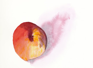
Peach Again

I intended to scan tonight's study a bit at a time but got lost in a phone conversation with an old friend. The plan would have been to drop in some cad yellow wet in wet in those white spots. In fact, it just might have looked fine stopping at that point. (I think that's what Judith alluded to in her yesterday's comment.) More to come! :-)


Shading still perplexes me. Perm mauve, pane's gray--neither satisfied. I liked rich perm aliziran crimson but only if I can keep the other colors in high key.

Monday, August 23, 2010

Poco A Poco Peach

Little by little. Taking my time. I have been rather rushing about lately, seemingly trying to get through a study, rather than taking the time to enjoy the process.

Here's a first shot at a peach. I need to work on form and color. There will be a new model tomorrow. Yep, this one was good eating! :-)


Sunday, August 22, 2010

A Butterfly's Wing

I recently came across this little (~1.5") wing on my walkway. It somehow survived a couple of days on the kitchen table! The other side looks completely different, mostly black with some blue.


Saturday, August 21, 2010

A Night Off

Although I usually find it easy to post a daily study, today I find myself simply recharging my batteries. Nope, not the laptop and smartphone, but my personal ones. :-)

This afternoon I visited Cohasset art galleries that left me so inspired--how others depict light and shadow, the handling of brush strokes in watercolor, that draw I feel towards oils, a reiteration of my personal goals.

And then there was that absolutely gorgeous work with charcoal and conte crayons...

Friday, August 20, 2010

Italian Pepper

This is probably my largest painting. I thought my #6 W&N was a pretty big brush until I pecked around for an hour or so and ended up with a blotchy mess. Then I remembered my set of inexpensive sables--Legends from Cheap Joe's--that I picked up a couple of years ago. Switching to a #12 helped smooth things over a bit but that brush sure didn't have much life to it, no snap back at all. I'll be scouting out something to replace that one.


Thursday, August 19, 2010

Celery Stalk

Well, it's rough, but I wanted to churn something out, even if I'd rather sleep. So here it is! :-)

I am experimenting with mixes for shadowing but still falling back to good old Neutral Tint. The bad of it is that once that paint in on the paper, it's there for good. The good of it is I can place colored washes above it without it mixing with and muddying up the color. Homemade neutral mixes to come at some point--I have quite a few books with artists offering up their own brews.

Now it's off to bed. G'nite.


Wednesday, August 18, 2010

Green Onion

There was a lot to learn with this study, especially shadowing. I used my OptiVisor #10 for the root shadows. Also ran into interesting work with taking the Permanent Sap Green warmer with Winsor Lemon and cooler with Viridian.


Tuesday, August 17, 2010

Red Red Pepper

After posting last night's chart of reds, I began thinking about all my mixing exercises. One of the points to be taken from all those charts was that, in general, nearby pigments make the most saturated mixes.

Mixing the last pepper with the red chart led me to think that Permanent Alizirin Crimson and Cadmium Scarlet just might get me close to that rich red. Actually, I think that mix pretty well nailed it!

I still had difficulty with shading.Crimson washes weren't deep enough. Payne's Gray seemed too drab. So, there's more to ponder, as usual, and that's what keeps me going. ;-)


Monday, August 16, 2010

Red

The recent red pepper study left me pondering my paint inventory. I wasn't able to get a deep valued and saturated red. Here are my reds with transparency and lifting tests, as well as overwashes with a few paints. I have orange-reds and violet-reds but where is that true red? Well, the Winsor Red swatch looks okay until it's next to the pepper, where it decidedly leans to orange.


So with all my tubes of paint, do I need (want?) another? Permanent Alizarin Crimson came close and the washes seemed promising. After poking around Handprint, I'm thinking Cadmium Red Deep for color and lightfastness.

Sunday, August 15, 2010

Wild Rose Leaves

Today brings a little experiment with wild rose leaves. My first leaf proved just how must attention I needed to apply to the serrations. Leaf two brought those teeth a bit more under control. The third leaf was an attempt to leave white space--a practice that takes considerably more time. Next time I'll use this technique in a less obvious fashion. None of these leaves really nailed the look of wild rose but it was all very good practice. I loved adding the evidence of leaf munching.


Saturday, August 14, 2010

Red Pepper

I don't consider this red pepper complete but I may just stop here. Using Rublev mineral reds to darken the Cadmium Scarlet became difficult to control as further washes disturbed the minerals. I'd forgotten how sensitive these pigments are. I think they're best used for one application only.

And there was more to learn from this study as I became sensitive to nuanced shading to portray roundness. Sometime soon I can see pigment studies--for instance, laying out all my reds by temperature in value ranges with tests for transparency and staining.


Friday, August 13, 2010

New Books

Three new books arrived today!


First it's Wendy Hollender's new book, Botanical Drawing In Color. This lovely book has some of the same illustrations from her first book and then a whole lot more. And, it is loaded with detailed text! I lost interest with her first book; let's see if I can do better with this recent release.


Next up is Principles Of Color by Faber Birren. The introduction states that this is an elementary book of color theory. Although I do study theory on the web and with books by Itten, this book may fill in some blanks for me.


Lastly, another book from the Cape Cod School of Art gang, Hensche on Painting by John W. Robichaux. These Provincetown artists' books of technique and inspiration are where I have been hanging out lately.


"My goal is to end up in painters heaven with Monet and Hawthorne and Velasquez, even if all I do is clean their brushes."
~ Henry Hensche

Thursday, August 12, 2010

Pineapple Top

A bit lighter and tighter than yesterday's perspective...


Wednesday, August 11, 2010

Pineapple Side

The title implies follow up work--that is, if I don't eat it first. Oh, it smells heavenly sweet.


Just as when I painted the rose, the onion, the grapefruit, I noticed the scents while working away. Each and every time, I seem to fall off an edge when I think, "Jeez, it's looking so much like the real thing that I can even smell it!" Ya right, Perry... duh... :-)


Tuesday, August 10, 2010

A Not So Pink Grapefruit

Here's another shootin' from the hip take. Well, not exactly a pink grapefruit, but it sure tasted like one. ;-)


Monday, August 9, 2010

A Slice Of Red

This onion caught my eye last night while making today's lunch, a reminder that I have wanted to try this for some time. Rather than working to be precise, I let some big band jazz push the brush around. And, it was fun!


Sunday, August 8, 2010

Color Play, and the beginnings of a studio.

Early exercises in Painting the Impressionist Watercolor encourage simple two paint wet in wet paint play. Set the range of values with only these two paints. I rather enjoyed playing with these cadmiums--Scarlet PR108 and Yellow Pale PY35.


I've been going through one of my phases of dissatisfaction--progress is too slow, things just don't look good, etc... So rather than wallow in my madness, I finally kicked off my plan to turn the spare room (a mess in its own right) into my studio. It's not yet a beauty but I now have a real tabletop for my paints. The kitchen table now belongs to kitchen activities! Seems the living room and the bedroom both also had their share of art toys, and now everything is in one place. Turns out I'm not the only one excited over this--Timothy the cat is flying about the house, howling when he stops to look wildly about.

Saturday, August 7, 2010

Thistle and Bee

This little one thought it was hiding out from me while I got my thistle and bees images. Ah, to be young...


The thistles in my yard are constantly visited. These blossoms must be laden with pollen as each bee spends a good deal of time on a single blossom. And sometimes, there's enough for two or even three.


As the blossoms go to seed, the bulb spreads open to release loads of fluffiness. Goldfinches cautiously approached for the seed but never close enough for photos.


And here's a little video of the bees in action.


Thistle and Bee from John Perry on Vimeo.