Saturday, December 29, 2012

Cleaning brushes

Some days I paint a little, break a little, and repeat. I get used to leaving my brushes out. And then I forget to clean them.

I've put off cleaning the most recent oversight for some time. I tried a soak in Gamsol but nothing doing. Spike oil would cut the dried paint but it's expensive stuff for cleaning brushes.

I heard that Murphy's would work so I put it up against the mighty turpentine, two brushes for each. The turpentine--fast, powerful, and full of toxic warnings--cleared up two brushes in 30 minutes or so. Murphy's took a few hours with its two but achieved the same results as turpentine! I can't find a warning of any kind on this product and its smell reminds me of lemon balm. Its MSDS doesn't seem to show any out of the ordinary cautions.


So unless I'm in a real hurry, and I can't imagine why, it's Murphy's for me! :-)


Wednesday, December 26, 2012

Inspired by an onion

In a painting from a few months back I found joy and frustration. I liked what I was doing with the light but felt some things were wrong. After repeated deconstructions, it became clear that I failed to show enough details, enough clues, to properly identify the sphere as an onion. Now, I didn't want to take this to photorealism or high botanical accuracy but I did want it to read as a vegetable. (I do have other issues to get to with this painting. We'll just take them one by one.)

I realized that if I couldn't properly draw an onion with good detail, how could I model one in paint with a slightly loose style? I don't think "loose" is about painting quickly and willy-nilly but actually a very controlled effect by an artist who know the details and knows how much detail can be left out.

I'm reading "Drawing From Observation" by Brian Curtis. It's bringing me to ponder what I see versus what I think I see. I think this is a fascinating subject and I'll get into more details in upcoming posts as I work further into the book's exercises.

For now, here are a couple of quotes from Chapter 3, Mechanics, that I find intriguing:
"Fluctuating line is the single most crucial element for establishing the overall level of sensitivity in a drawing."

"Every mark that you make needs to be in constant flux to embody the restless energy and tension that underlie the functioning of our biological organism and, more specifically, our perceptual experience."

So for now I am going to freely play with line. And onions. This won't get my onion properly painted today or even next week. But that's okay. There's no rush.

Here's one with a blunted 2B.  Where is my sandpaper...


"A line is a dot that went for a walk." 
                 Paul Klee  1879-1940

Monday, December 24, 2012

Merry Christmas

After a few months of introspection, I think I'm back. More on the details in upcoming posts but for now I'd like to share inspiration by way of my teacher, my mentor. Some time ago she was standing over me and quoted while I worked through an old master design exercise:

"Begin by adorning yourself with these vestments: Love, Reverence, Obedience, and Constancy."

Cennino d'Andrea Cennini 1370-1440

You know those moments when time disappears and your art is really working? That quote reminds me of this.

Friday, October 5, 2012

Viridescence

I have a few pieces on display at Cornell University's Alfred R. Mann Library. Marcia, my instructor for all three botanical art classes, recently brought this exhibit together. It couldn't have been any easier for artists. All I had to do was was place high resolution images into my public Dropbox!

For details on each course, see the links at the top right on my blog.


Sunday, September 23, 2012

Momentum

After a few weeks of focusing on my first still life, I felt the vacuum upon calling it done. I did have a couple of limited palette charts that needed wrapping up.

In this first chart the center row contains the starting pigments. Columns 1, 4, and 7 are the tubed colors, others being mixed neighbors. Kind of amazing the color range!

Yellow Ochre, Ercolano Red, Ultramarine Blue
Mixed with Vine Black or Titanium White

This second chart is certainly a more subdued version and seeing that I used Vine Black for blue, I left out darkening with black, going only for tints with Titanium White. It might sound odd but I can stare at these charts for the longest time, imaging the worlds that could be built with such a humble set of pigments.

Lemon Ochre, Burnt Umber Reddish, Vine Black
Mixed with Titanium White

In an effort to keep work ahead of me, I started a couple of studies. This first is based on an painting by Adriaen Coorte. Many of his paintings make use of a table top, mostly of stone. I like his warm/cool methods and I'm trying to apply them here. Next I will straighten my edges (they were hand painted, no tapes or tools) and then paint in some sea shells.

Raw Umber Green Dark, Burnt Umber Cyprus Dark

I'd painted this portion of a Luis Melendez painting some time ago. Now I'm retrying it using a method that I am picking up second hand from an artist friend studying in a local atelier. The surface is first coated with Burnt Umber Cypress Dark thinned with OMS. Form is developed by rubbing out with a rag in my hand, a rag over my finger, and a cotton swab. In some cases I have to pick up the brush and reapply pigment. It's really quite thrilling to see an image begin to appear out of the darkness. I wanted to push this further but by 2 AM I was fading and knew this umber would be dry when I woke.

Rub out technique.
Burnt Umber Cyprus Dark

So now I have two pieces in my queue and I'm working on laying out another Melendez copy piece. By the way, I've jumped away from smooth panels--birch plywood, GAC 100, acrylic gesso--and switched to linen. The charts are on linen pads, the paintings on linen panels. Both products are Centurion OP DLX, deluxe oil primed linen. I enjoy the grab of the canvas against my brush and paint. Additionally, the rub out technique needs the linen's texture.

Tuesday, September 18, 2012

My First Still Life

I've been hunkered down with this piece for the past three weeks. I first built a composition with natural light, photographed, and printed out various tonal arrangements to help me set values. With the exception of titanium white and ultramarine blue mixed with burnt umber for the deepest shadow, the oil-based pigments are earths--ochres, umbers and green earth.

After the first week or so I might have stopped. Rather, each evening I'd poke about with new ideas. Curiously, a change in one spot might reverberate calling for updates in other areas. An often felt example was that of making a change on a single clove in that bulb of garlic and how it would disturb the overall form of the bulb. All in all, just a wonderful learning experience.

The surface is very shiny at this point, making it tough to photograph. I took advantage of filtered overcast sky to work around the glare and this photo is reasonably close, albeit with a bit of value and hue shifts.


Friday, August 31, 2012

Thursday, August 30, 2012

Mycelium Musings

Recent rains seem to be the stimuli for hidden mycelium to fruit. All were found within a fifty foot span.


Wednesday, August 29, 2012

Around the lake

I've lately been back to my daily explorations around the lake. The heat of summer is waning, nights becoming cooler. Late summer wildflowers presage the glorious fall colors soon to arrive.

Let me kick off this series of visual posts with my favorite "around the lake" spot.

Reflecting Pool

Starling acrobatics

Joe Pye and Goldenrod

Wednesday, August 8, 2012

Lily Work

The paper support from the previous post just didn't feel satisfying so I brought out one of my new birch plywood panels and transferred the design. I began with a grisaille underpainting and then explored glazing lightly. I was working from a monotone printout posterized down to just four or five values on the lily.

I then mixed strings of yellow into brown--cooler colors for the highlight and halftone; warmer colors for the local color and shadow. I spent a good deal of time standing back up to ten feet or so, working to get the form to read well from a distance.

I'm now going back in, developing detail while holding the overall values in place.


Sunday, July 15, 2012

Yellow Day Lilies

I've been on a quest since the yellow day lilies in my yard began flowering. Nearly every day there has been a photo session for reference material. Once I sat out sketching to become more familiar with details. Then I've been out there taking measurements and notes. Lastly came color studies.

A hand mulled yellow, PY154, proved too warm so an order with Kremer supplied a relatively cool PY184. I also mulled up a tube of PG36 to pull any needed green while keeping the chroma high. From my studies with "Yellow and Blue Don't Make Green" as well as Munsell, these pigments  promised to return nice high chroma.

I created this chart to explore the possibilities. Three days work here, phew.


Next I simply wanted to explore getting paint down. Rather than work on design, I selected one of my many photos, cropped, and printed on the b/w laser. I applied one coat of Golden's GAC 100 to the front side only to seal off any oil absorption and began painting on the paper taped to a panel.


This is proving to be a good path for me as I get to explore tone and color in easy fashion. I can make up these printouts in minutes and they feel like wonderful practice.

Wednesday, July 4, 2012

Panel Making

I've been back to panel making, inspired by recent conversations with Golden technical support. The following took place over the past five days.

Birch plywood now replaces hardboard (masonite). I had a sheet of 3/16th's laying around. In the future I will probably increase thickness as there was a bit of warping with a couple of the panels. Ya, some were just fine and I don't know why.

Birch plywood (3/16")
After cutting to size came a bit of sanding with 100, 150 and 200 grit to round off the edges and corners and a light scuffing with 200 grit over the entire panels.

Rounding edge and corner
I opted to use GAC 100 before applying gesso. I like the idea of isolating the raw support from the gesso. Maybe different woods have varying absorptions? I don't know, but perhaps this helps to take some variables out of the picture.

Golden's GAC 100 dries to a tacky touch. Stack panels and they will stick slightly together, coming apart with a clicky grip. There is no sanding to be done with this stuff. Brings the grain out nicely, doesn't it?

Two coats of Golden GAC 100
In the previous post we found that the new sandable gesso does not need base coats of regular gesso. I still have the old stuff here so needed to firstly apply a couple of coats of "regular" gesso. There was no sanding with these coats.

Two coats of Golden Gesso
My workflow is to lay out the panels and walk them to my painting station one by one. Paint a side and put it back. Once done, restart with the other side. It helps to assure me that I equally coat all sides. The gesso products dry to touch so quickly that I can paint nonstop.

Keeping order
Here are the first two coats of sandable gesso. I experimented with various toning media. Acrylics behaved just as nicely as aqueous dispersions. Wish I would have had a tube of deep dark acrylic. It takes a lot of pigment to pull down that gesso. I now think of it as white paint!

I let these first two layers of sandable gesso dry for a day and then sanded with 150 grit to remove most brush marks. The surface was already quite smooth but I just wanted to knock it down a bit. Must one wait a whole day before sanding? Perhaps an hour or so would be adequate. Not sure...

Toned with Golden Acrylic (left) and toned over with aqueous dispersion (right)
Here I tested dry pigments premixed with water using a palette knife. Although the pigment appeared to be well mixed...

Mixing wetted pigment with Golden Sandable Gesso
When I began applying sandable gesso toned with my mixed pigment I was in for a big surprise. The gesso went on very light with dark streaks. Essentially I was mixing my paint on the support! I considered halting work to properly mull the gesso but kept on, eventually applying two coats front and back to all panels.

It will be well worth my time to try mulling pigment (that is, rather than just mixing with palette knife) and mixing with sandable gesso. I use my dry pigments for many purposes already so why not use them here as well? I thought I'd prefer acrylic in a tube but I'm leaning back to my old friends. (I recently inventoried my pigment collection--over 60 of them!)

Streaking pigments
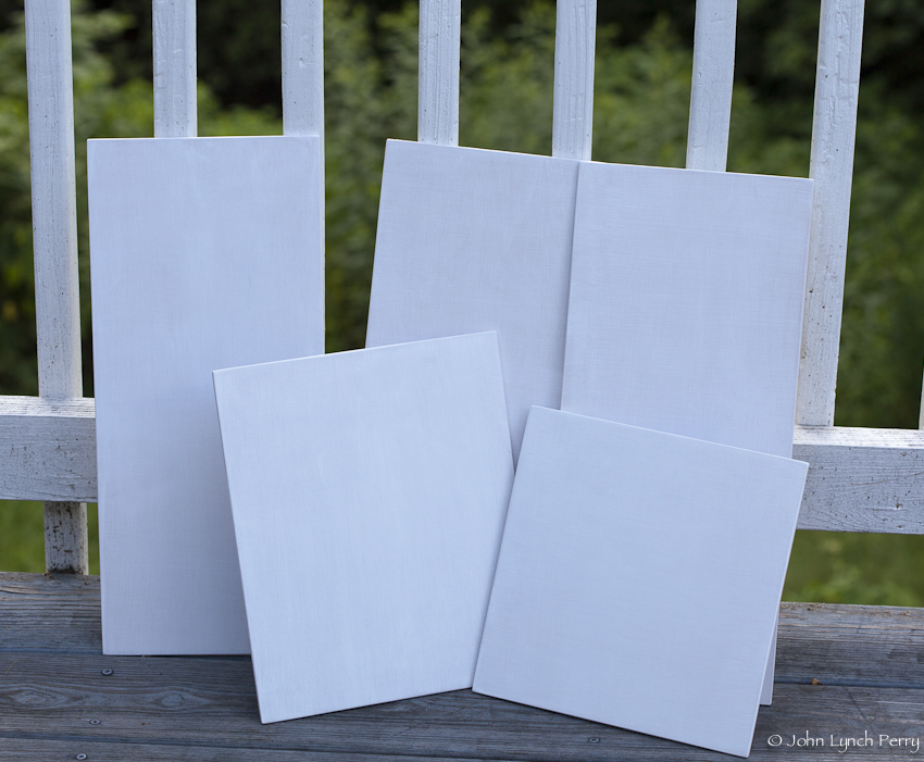
And here's my results! Tomorrow I will give them a light sanding with 150 grit to level them off. I may go to 200 or higher grit with a few as I begin experimenting with first applications of oil paint.

Final coats drying