Showing posts with label Old Master Design Extended. Show all posts

Friday, September 23, 2011

Stepping Stones

Koo Schadler's "Old Masters Design" workshop has sparked me into Renaissance studies. I am knowing less and less each day. Lucky for me, my town's library budget is finally on the mend, with hours expanding considerably just as I left work.

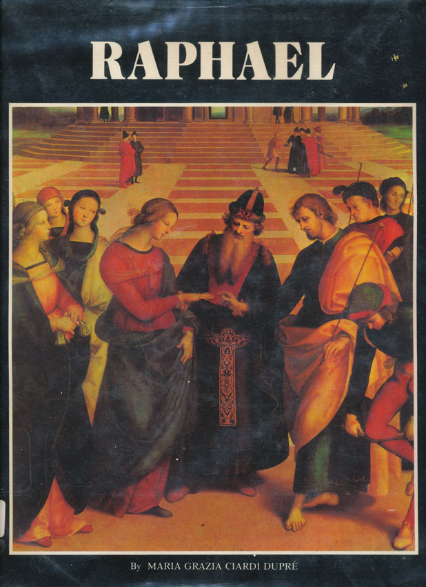
Raphael is a wonderful picture book. I'm on the lookout for a used copy as I'd like to try at least portions of a few paintings.

"Poison" was a great read, light on Renaissance but heavy on religion, poison, and intrigue.


The BBC's "Renaissance" is tough going for this easily distracted mind and I might not make it through because...


this arrived today. The Kindle sample proved fascinating but the images were poor at best. The book itself has rich images on heavy semi-gloss stock. It's a beautiful book.

Thursday, August 18, 2011

A Better Bowl

I think this is much closer than yesterday's image to a good composition . I can feel a bit more tweaking here but I'll sleep on it.


I found the bowl about the house. The black background is a tee shirt. The white surface is a foot square piece of marble tile I picked up at Home Depot this afternoon. The cherries were all I had left after last night's devouring.

Edit: A couple of hours later, after another shoot and bit of cropping... No cleanup processing here as I'm just looking at composition.


Friday, August 5, 2011

A New Background

I am busy at work on a new board for the lily. Green earths, yellow ochre, and burnt and raw siennas, layer after layer, are coming together. Every four or five layers brings a cheesecloth polish and there is even a light sanding in there.

My first background board still resists coming to a hard and smooth surface. I am carefully mixing my medium and pigment and this new board shows that. Restarting is really a blessing as I get to gain experience and I think that various greens will contrast nicely with the lily's oranges.

I know it all looks warm at at this time but I am going to try to really darken up, maybe even close to black, the border. Midway in I will be moving to Viridian to provide a cool region. The center, which will be mostly covered, will be warm. I want to keep in mind a relative state of cool and warm--another major principle from my Old Masters Design workshop. From time to time I hold up my earth orange swatch to keep me in line.


Tuesday, July 19, 2011

Ginevra d'Benci 3

Hers's another try at that portrait. Each attempt opens me up to more ideas and details. Light next to dark in abrupt transitions are particularly intriguing. I worked on this up to nodding off--not a good thing! Mistakes come easily when I am tired but I'm having such fun that it's difficult to stop.


Sunday, July 17, 2011

Copying Continues

After yesterday's post I retried the same image, this time dropping in guide lines with a transfer using white Saral and a laser printed image. The Saral left a seemingly uncontrollable line, either heavy and solid or nothing at all, leaving me to erase most of what I put down. I think a red ochre handmade transfer paper is worth a try.

I am working from Leonardo da Vinci's portrait of Ginevra d'Benci. Yesterday I mistakenly labeled it as egg tempera. The National Gallery states this is oil on panel.

Most students in my egg tempera workshop selected portraits. I had no interest, that is until now. I have a plan to rework this portrait into one of my lovely niece Bethany. Exciting stuff!


Saturday, July 16, 2011

Copying Old Master Drawings

As usual, around here one thing inevitably leads to another. I recently picked up a copy of William L. Maughan's "Drawing the Head". The exercises call for toned paper with red and white pastel pencils. I'm trying to simulate the effect with Stonehenge Fawn paper and Polychromos Burnt Sienna and White. The White is annoying--very shiny that lends to a creepy look, but it's good enough until the real pastels get ordered up.

This afternoon I began rereading "Drawing Lessons from the Old Masters" by Robert Beverly Hale which reminded me that Koo encouraged us to copy Old Master drawings and paintings. So next I was skimming through Taschen's "Leonardo da Vinci" by Frank Zöllner.

I'm equally pleased and distressed with my first attempt at copying a portrait. At this point I don't think one could even guess who this might be but I'll be practicing. I didn't realize until just now that the Taschen book has lots of closeup images of portions of the portrait, all with incredible detail. What becomes apparent is that line is nearly nonexistent. Gradual transitions are key. By the way, this portrait was painted in egg tempera.


Tuesday, July 5, 2011

Values

Drawing from the Old Masters Design workshop, what is probably the most important principle is that of clear sections of dark, medium, and light tonal values. On my first day of the workshop, I proudly presented a print of this image. Koo immediately said "No lights!" I explained that of course there were lights, "Just look at that highlight on the pear." After a couple more exchanges, I finally got it. A highlight on a turned form is not a light tonal mass. Each tonal value has to be some kind of object or mass of objects--not just pieces of an object.

This image is, I think, a good example of all three tonal values. And besides that, it also has some interesting black shapes as well as massed tonal values across the lily pads.


Here's a desaturated version of the pear image referenced above. See? No lights!

Saturday, July 2, 2011

Fluorescent Light Comparison

The BlueMax bulbs are in and most welcome. Here is a side by comparison with a warm light bulb I'd been using and the new BlueMax bulb. Each side is lit with a corresponding bulb. An isolating sheet of white cardboard is in place down the middle.

The warm bulb is labeled with a color temperature of 2700K and CRI is not listed. The BlueMax is labeled with a color temperature of 5500K and a CRI of 93.

Isn't it amazing how we adjust our color perception to lock onto "white"?

2700K                          5500K