Showing posts with label Leaf Printing. Show all posts

Friday, August 6, 2010

Black Ink Prints

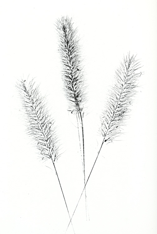
Here's my second try at some grass seed heads. The first cut was pretty good until I tried to press the grass leaves--too straight and boring. The center stalk here was a bit of trouble and it looks like I rubbed it in one too many times. All in all, this pressing came out even better than I had envisioned. Cool.


Now, this guy was another story. The Queen Anne's Lace just didn't take a good application of ink. I think if I had a pad with slightly more ink that I would have had a winner.


Tuesday, August 3, 2010

New Inks

I picked up new inks at the local Joann fabric and craft store. The black is from Studio G--2 x 3 " rectangular pads, the colors from Tsukineko--little 1 x 1.5" VersaMagic eye shaped pads. The Studio G black is a tight pad, but two others in silver and brown have an open foam pad. The VersaMagics use a thick opaque ink that goes on a bit heavy, so that I find that I can first press into a paper towel before going to the sketch pad.

Do see Gretchen's comment in this post, the inspiration for today's printing.


Lilac and Crabapple


Catalpa


More Lilac and Crabapple

Sunday, August 1, 2010

More Press and Print

After just one day, this Queen Anne's Lace flattened out nicely to paper thin, although still feeling a bit damp and very delicate.


I'm still in a leaf printing kind of mood. A couple of tries using Sweet Pepperbush in the same style as yesterday.


Green Brier, with its waxy leaf coating and minimal parallel veining, produced an entirely different result. I dropped on a light wash of Schmincke Gold watercolor to pull in all the empty spaces.


Saturday, July 31, 2010

Leaf Printing - Ferns

This afternoon I got in a little leaf collecting and pressing, which led me to thinking about printing...

Winsor Green YS watercolor and Holbein Rich Gold gouache. In this first image, the fern sections were brushed with color, placed on sketch paper, and pressed with heavy cardboard. After trying various consistencies, it just seemed that the watercolor didn't detail, although the gouache was showing promise.


Switching to Oxide of Chromium seemed to improve detail. Was it consistency, opacity, or both? Not sure about that, but I did like the color combination. For these last two test, instead of painting the fern sections, paint was applied to cardboard and the fern positioned and pressed into the paint. I somehow accidentally switched over to Holbein Brilliant Gold Gouache (duh...) and those oversized sparkles reduced detail.


I liked the look of the overlaid gouache so dropped bits of gold gouache on the Oxide of Chromium before pressing the fern into the paint. There is kind of a nice sparkle on the printing that's missed here.